Comparative Perspectives -
Heights of Mountains, Lengths of Rivers
[click on any image for the large version. Very large versions also available]
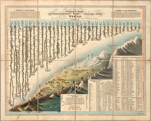
Illustration Title: Comparative Heights of the Principal Mountains and Lengths of the Principal Rivers of The World
Publisher: William Darton
Publication Title: 'New and Improved View of the Comparative Heights of the Principal Mountains and Lengths of the Principal Rivers In The World, The whole Judiciously arranged from the various Authorities Extant'.
Author: WR Gardner
Date: 1823
The writing in the top left corner of the plate:
'Notices to the Rivers'
"In the construction of the Rivers, it is necessary to observe that our intention has been to effect three grand objects; First, to give to all their true Geographical course and Figure; Secondly, their Comparative Lengths from their Source to their respective destination, and, lastly, their Lengths as would be obtained by the Sailing of a Vessel in the centre of the Stream, as correct as the best Maps will allow. This explanation will (it is presumed) account for the apparent inconsistency that appears in the arrangement, from the irregularity of their Lengths, which is occasioned by the contraction of some from the numerous meanderings in their course, for Example; the Hoan Ho [
Yellow River], appears longer than the Mississippi, the former being more direct, & the latter more numerous in its windings, so with regard to the rest."
from 'Tooley's Dictionary of Mapmakers' --
[
book • review]:
"This may be the earliest chart to depict the heights of mountains and the lengths of rivers together in one illustration, with the rivers hanging down over the mountains.
Wolter1 says that Bulla's
'Tableau Comparatif' of 1826
[-see below-] is the earliest of the combined mountain and river type, but he had not seen this chart by Gardner done three years earlier and does not list it. This chart is beautifully done and, while not large in size, it is impressive in its scope.
Full color. Map is mounted on linen, dissected into 8 sections with an end sheet label reading "The Most Approved Modern Maps, Plans, And Charts, Of every Description, From The Best Authorities, Constantly on Sale at William Darton's Map, Print, and Chart Warehouse, 58, Holborn Hill, London...". Map folds into a dark green marbled cardboard case with a turquoise paper label printed with the map title (as above); there is a "William Darton's, Map seller" bookplate label on the back of the case."
1'The Heights of Mountains and the Lengths of Rivers', IN:
Quarterly Journal of the Library of Congress, July, 1972. [also, see
Wolter's book]
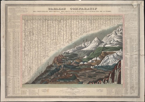
Print title: Tableau comparatif des principales montagnes, des principaux fleuves et cataractes de la terre d'apres les observations des plus savants voyageurs
Publisher:
Chez Bulla (Paris) {engraving by Lallemande}
Date: noted as "1820-1829" but most likely, 1826.

Illustration Title: Comparative lengths of the principal rivers throughout the World. Comparative view of mountains.
Publisher: Collins & Hannay (New York)
Publication Title: School atlas to Cummings' ancient and modern geography improved
Author: Jacob A Cummings
Date: 1829
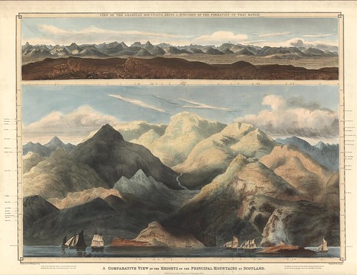
Ilustration Title: A comparative view of the heights of the principal mountains of Scotland {details below}
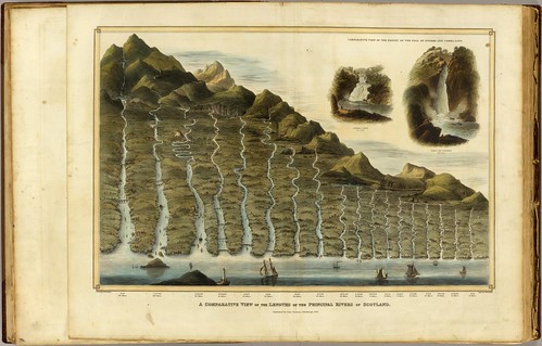
Illustration Title: A comparative view of the lengths of the principal rivers of Scotland. [(with) Comparative view of the height of the falls of Foyers and Corra Linn.]
Publisher: John Thomson, Edinburgh {engraving by WH Lizars}
Publication Title: 'The atlas of Scotland, containing maps of each county, on a scale so large as to exhibit the features of the country, and places of importance; the boundaries of the shires ... Accompanied with a Memoir of the geography of Scotland, view of the comparative length of the rivers, height of the mountains, and a consulting index, to facilitate the finding out of places, &c.' [otherwise known as:
John Thomson's Atlas of Scotland]
Date: 1831 (1832)
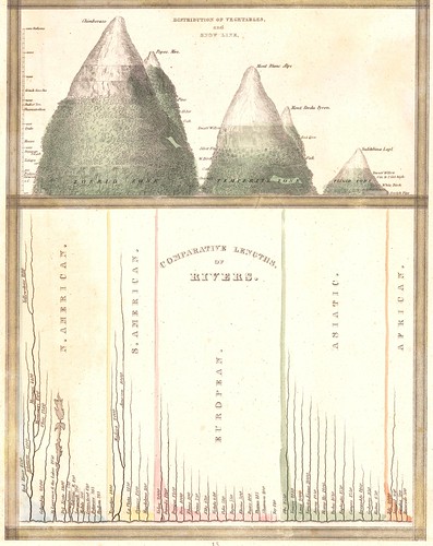
Print Title: Distribution of Vegatables and Snow Line + Comparative Lengths of Rivers
Publisher: Thomas Gamaliel Bradford (Boston)
Date: 1835
"One of the earliest obtainable comparative charts published in the United States. Divided into the Torrid, Temperate and Frigid zones. The graphics are color coded to show North America in Blue, South America in Yellow, Europe in Red, Asia in Green and Africa in Brown."
[
image source] [
alternative version -
source]
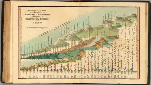
Illustration Title: A comparative view of the heights of the principal mountains and lengths of the principal rivers of the World
Publisher: Joseph Thomas
Publication Title: Thomas's library atlas, embodying a complete set of maps, illustrative of modern & ancient geography.. [
title page]
Author: Reissue of Fenner's Pocket atlas of 1830
Date: 1835
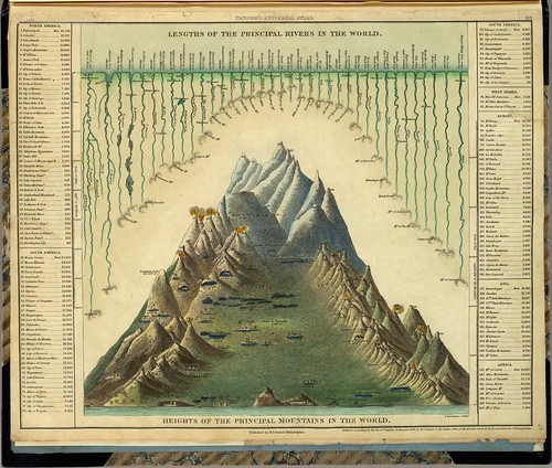
Illustration Title: Lengths of the Principal Rivers in the World. Heights of the Principal Mountains in the World.
Publisher/Author: Henry S Tanner (Philadelphia)
Publication Title: A New Universal Atlas Containing Maps of the various Empires, Kingdoms, States and Republics Of The World.
Date: 1836
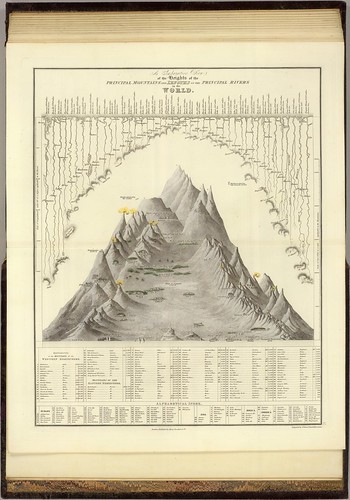
Illustration Title: A Comparative View of the Heights of the Principal Mountains and Lengths of the Principal Rivers in the World
Publisher: Published by Henry Teesdale & Co. (London) {engraving by J Dower}
Publication Title: A New General Atlas Of The World, Compiled And Constructed With The Greatest Care From The Latest Government And Other Approved Modern Surveys And Authorities, Both English And Foreign
Date: 1844
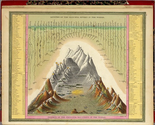
Illustration Title: Lengths of the Principal Rivers in the World. Heights of the Principal Mountains in the World. {
yes, this is a copy of the Tanner image, up above}
Publisher: HN Burroughs (Philadelphia) {lithography by F Humphrys}
Publication Title: A New Universal Atlas Containing Maps of the various Empires, Kingdoms, States and Republics Of The World
Author: Samuel A Mitchell
Date: 1846
"The first issue by Mitchell alone, without Tanner's name on the title page. Tanner issued this atlas first in 1836 with engraved maps, then it was taken over by Carey and Hart in 1843 and converted by them to lithographic maps in 1845. In 1846 Mitchell took over the publishing of this atlas and continued until 1849, after which it was published until 1860 by Thomas, Cowperthwait and then Charles DeSilver."
"This atlas is important in American printing history in that it was the first American atlas to be converted from engraved map plates to lithographic map plates - greatly reducing the cost of production and thus making the book made widely affordable by the general public."
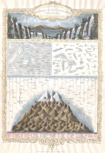
Print Title: A Comparative View of the Principal Waterfalls, Islands, Lakes, Rivers and Mountains in the Western Hemisphere.
Publisher: John Tallis & Co.
Date: ~1850
"This is Tallis’s c. 1850 chart of comparative geographic features for the Western Hemisphere. Shows the islands of New Zealand, Cuba, Iceland etc., the Great Lakes and others, the rivers Mississippi, St Lawrence and Amazon and the mountains with the highest given as Nevada de Sorata, South America. This particular chart was likely not issued with Tallis’ Illustrated Atlas. Given its double fold lines, it is safe to assume that this map was issued to illustrate a book or other text."
"John Tallis and Company published views, maps and Atlases in London from roughly 1838 to 1854. The principal works, expanding upon the earlier works of Cary and Arrowsmith, include an 1838 collection of London Street Views and the 1850Illustrated Atlas of the World. His principle engraver was John Rapkin, whose name and decorative vignettes appear on most Tallis & Co. maps. Due to the decorative style of Rapkin's work, many regard Tallis maps as the last bastion of English decorative cartography in the 19th century."
"Though most Tallis maps were originally issued uncolored, it was not uncommon for 19th century libraries to commission colorists to “complete” the atlas. The London Printing and publishing Company of London and New York bought the rights for many Tallis maps in 1850 and continued Publishing his Illustrated Atlas of the World until the mid 1850s. Specific Tallis maps later appeared in innumerable mid to late 19th century publications as illustrations and appendices."
[source]

Illustration Title: A Comparative View Of The Principal Waterfalls, Islands, Lakes, Rivers and Mountains, In The Eastern Hemisphere
Publisher: John Tallis & Co.
Publication Title: The Illustrated Atlas, And Modern History Of The World Geographical, Political, Commercial & Statistical
Date: 1851
{note: The companion
Western Hemisphere illustration, one above, appears in the non-coloured form in this same publication}
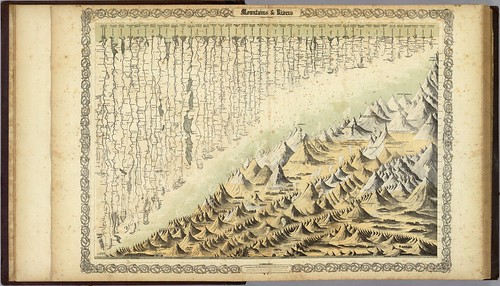
Illustration Title: Mountains & Rivers
Publishers: JH Colton & Co. (New York)
Publication: Colton's Atlas Of The World, Illustrating Physical And Political Geography. [..] Accompanied By Descriptions Geographical, Statistical, and Historical
Date: 1856
"This atlas was the first world atlas produced by Colton, after many years of issuing pocket maps, wall maps, guides, and maps for books. The atlas was one of the finest and most accurate of the period - it had a long publishing run, continuing for over thirty years"
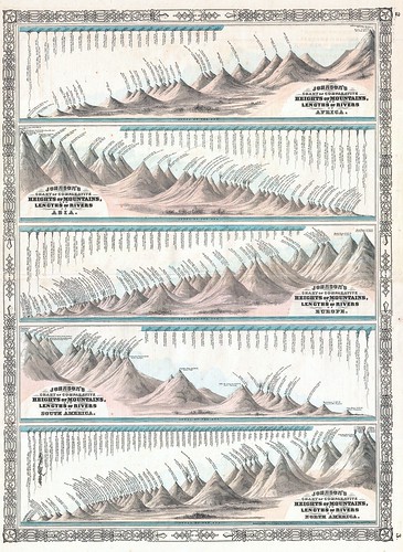
Print Title: Johnson's Chart of Comparative Heights of Mountains and Lengths of Rivers of Africa, Asia, Europe, South America and North America
Publisher: AJ Johnson
Date: 1864
"This is a magnificent 1864 hand colored chart or map of the world’s great mountains and rivers. Exhibiting a significant advance over the old Colton Mountains and Rivers chart (which Johnson continued to publish until 1862) this chart is divided into the five continents: Africa, Asia, Europe, South America and North America."
"A. J. Johnson published maps from 1856 to the mid 1880s. He began his publishing empire when, in 1859, he bailed out the fiscally stressed Colton map empire. As part of the deal, Johnson acquired the rights to use Colton’s map plates in his own “Johnson’s Atlas”. Johnson issued the first “Johnson’s Family Atlas” in 1860. With the publication of this atlas he transferred the original Colton steel plate engravings to cheaper lithographic stones, allowing his firm to produce more maps at a lower price point.
The next three years would see Johnson rise to become the most prominent American map publisher of his period. At the outbreak of the Civil War, in 1861, Johnson transitioned his publishing firm from Virginia to New York. Also around this time, Browning was bought out by Ward and his imprint “Johnson and Ward” begins to appear on the maps. A few years later in 1864 Ward, in turn, was bought out by Johnson himself and his imprint disappears from the maps. The Johnson firm continued to produce maps and atlases until around 1885. Johnson maps are known for their size, accuracy, detail, and stunning, vivid hand coloring."
[source]
----------------
ADDIT (June 2012) - SEE the fabulous:
'Mountains & Rivers. By Johnson and Ward. (to accompany) Johnson's New Illustrated (Steel Plate) Family Atlas, With Physical Geography, And With Descriptions Geographical, Statistical, And Historical' 1864, recently digitised by by the
Rumsey Collection.
The 'maps'2 above were obtained from: David Rumsey Historical Map Collection (most), Geographicus Antique Maps, the National Library of Scotland, the National Library of Australia and Alabama Maps.
2[tangential, at best: Ruminations on the Borderlands of Cartography]
••
Update•• -
(via Noelia's comment) Another
novel comparative mountain/river view at the
Institut Cartogràfic de Catalunya** (they also have a higher res. version of the
'Tableau Comparatif..' map seen above).
In relation to the outstanding
Rumsey Collection: {which, incidentally, uploaded a
new batch of about a thousand maps at the beginning of August}----
*****
This link takes you to the river/mountain maps*****
You can load each map into a zoomable browser tab which is fine for having a casual look. But! The download link in the sidebar doesn't work.
The following information is for anyone who wants to get full size versions from the Rumsey Collection:
-
This link will launch the InsightBrowser from which the whole Rumsey collection can be viewed. To obtain the highest resolution/largest plate images: search for and launch the desired map. There is an icon in the viewing sidebar - parallel lines - that launches a screen with information about the map. In this screen, if you scroll down, there is a download link. But! First you have to download the MrSID browser (the zip file link is below the MrSID file download link).
I mention this because the MrSID format is
by far the best way to obtain the highest resolution image. For various reasons, which would probably reflect poorly on my intelligence were I to reveal them, this took me a long time to comprehend; after strong-arming the URLs and wasting bandwidth with jpeg images ultimately precipitated browser crashes &c.
Once you download the MrSID file (they are all <10mb), the file can easily be converted to a very large tiff file (probably good enough for poster printing). If all this hasn't made total sense and you want the highest resolution image possible, drop me a line. [
This paragraph above has been edited - a whole chunk of text got mysteriously wiped when I added the update above. I don't think I'd written anything else of much significance.]
------------------------------
In what must have been something of a eureka moment of innovation, the originator of the comparative map (rivers, mountains, lakes, islands, continents &c.) presentation style perfectly captured the common ground between science, graphic design and education. It's equally possible to imagine a geographer, artist or teacher having conjured up the idea for such a novel means of data visualisation.
It provided the opportunity to convey important factual information in a logical but accessible format, could be developed or manipulated into a variety of appealing and eye-catching designs and offered an enticing means by which to interest students who otherwise found the subject of geography fairly boring. The added bonus, as mentioned above, was that the evolution of this comparative map genre coincided with the development of lithography and cheaper printing methods, so there was an increasing demand for visual ingenuity.
The style proved popular for about forty years across the middle of the 19th century and inexplicably fell out of favour by the turn of the century. The maps above are definitely worth seeing in large format. The most interesting aspects are to be found in the details: the arbitrary construction and order of the rivers, the prevalence and choice of man made objects for perspective, such as the pyramids, and the (also) inexplicable and curious prevalence of Dublin; among other things.
Thanks variously to
Michal Migurski and
John Ptak (see John's
recent post on this very subject)
UPDATE: See
Geographicus, who provide further history about the genre.