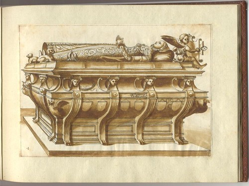

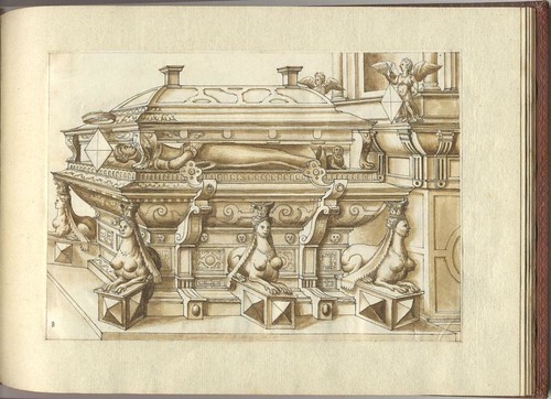
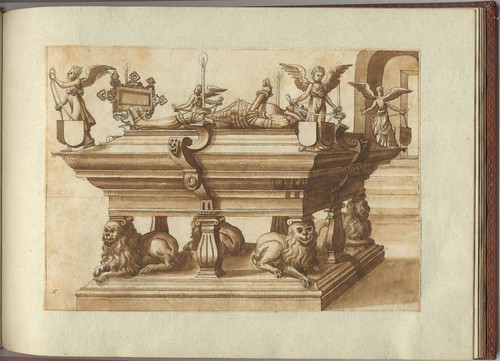
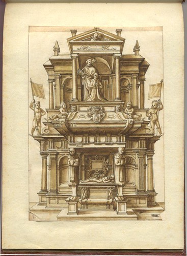




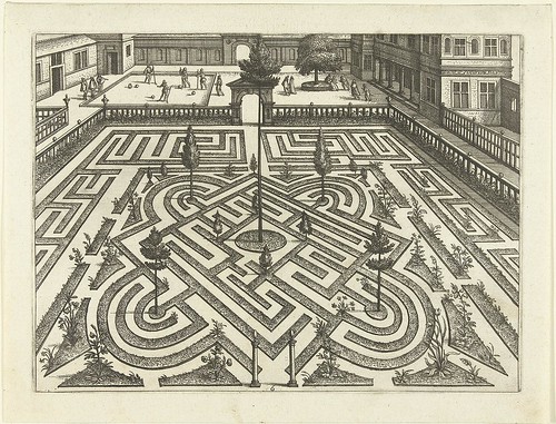

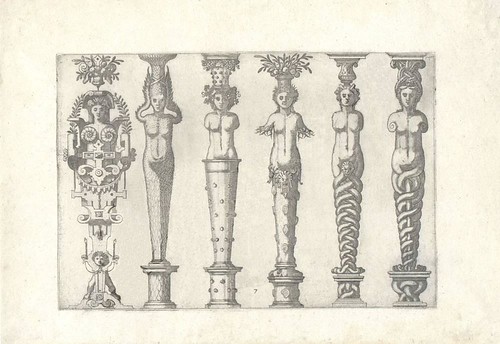
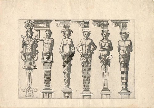

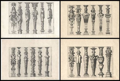
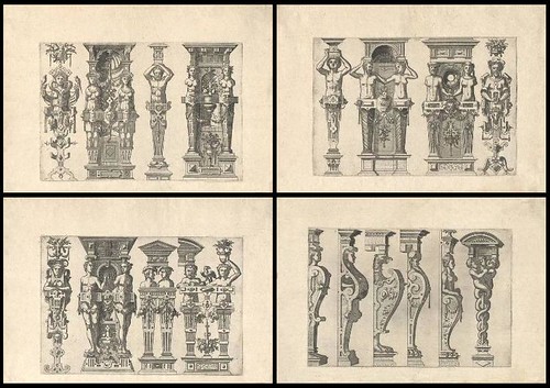
16th century designs by Hans Vredeman de Vries, sourced from Rijksmuseum, University of Heidelberg, Frisian Historical and Literary Centre and Ornamental Prints Online.
Originally, the intention here was to focus in on the outlandish columns and plinths (from 1565) seen in the last half dozen or so images above. But providence would have it that the large-ish format images of the desired material was accompanied by some of the most intrustively toxic watermarking it has ever been my misfortune to encounter.
My energy and patience was zapped after painstakingly - and not quite successfully- removing or reducing the watermarks in the two larger images featuring columns. So the rest were assembled into quartets of the smaller versions by way of compromise. (many of the balance of the above images were background cleaned too, just by the way)
I was drawn to the columns because they pre-date a few other sets of ornate fantasy pedestals or caryatids that have been showcased on BibliOdyssey previously. Together, all these works appear to constitute something of a genre of onwardly-evolving architectural design fantasies, restricted only by the imagination of each of the artists/engineers/architects involved. Check out the following old entries to see the weird permutations of the 'style' (and no doubt this collection is woefully incomplete, in the bigger academic picture, but nevertheless very cool in the "I had no idea gobbling down handfuls of magic mushrooms was a prerequisite for architectural design in the 16th century" kind of way) ...
In year order of publication:
- The Architecture of Embellishment (Hugues Sambin, 1572)
- Architectural Zoology (Joseph Boillot, 1592)
- The Motifs of Understated Architecture (Part One and Part Two) (Wendel Ditterlin, 1598)
- Sandrart's History of Art and Architecture (Joachim von Sandrart, 1675)
***Be sure to see the follow-up, The Architecture of Fantasy II, for more examples, background detail and links***






10 comments :
The columns are entertaining, but I was more struck by a couple of other things, namely:
1) While I'm familiar with the practice of putting an effigy of the deceased atop a tomb, this is the first time I've ever seen the effigy of the deceased sandwiched between an upper and a lower... well, are they separate coffins or is the upper thing a fancy canopy to keep the rain off the effigy? Or is the whole thing actually an opening-up tomb from which the deceased is levitating (under the lid) and will then fly sideways and escape? (I'm starting to envision an animated cartoon of this, to be done after I learn animation software at some unspecified future time...)
2) The magic mushroom notion is rather apropos to that one garden labyrinth, I think; as far as I can tell, the entrance to the labyrinth takes one to a dead end next to the dead end one reaches if one starts at the center. Or am I under influence of something to think that this is the case? Aren't labyrinths (unlike mazes) supposed to lead the traveler to the end and not, inexorably, "up the garden path?"
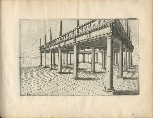
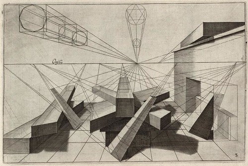
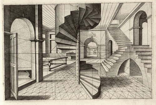
The perspective in the two spiral staircase illustrations is erroneous, as it is in the illustration immediately preceding them, in which all the vanishing points are on located on the horizon line, which is impossible for those forms that are inclined or not horizontal. The vanishing points for those object should be above or below the horizon. I've always thought these were egregious errors in what was supposed to be a textbook of perspective practice.
I'm speechless. So beautiful.
Thank you for all your work.
Jolie leçon de perspective architecturale !
Merci Peacay.
Jarreau said...
"Awesome post. Those renderings are magnificent."
----
(self linked comment deleted)
I love Karla's comment!
If you don't, somebody should! Very Monty Python!
Ah, Kittybriton, you refer to one of my formative influences. (Have you seen Terry Gilliam's book Animations of Mortality, a slim volume in which the author purports to show us how to make truckloads of money from animation?)
While I have given up on certain ambitions (paleontology, for example), I still nourish the fantasy that I will take up animation, especially as more and more ideas for it crowd my disorganized brain, a good many of them prompted by images here.
http://www.flickr.com/photos/moow/sets/72157608402907390/
some scans
Estoy francamente alucinada con esta pagina maravillosa.
Estou francamente louco ;- )
Post a Comment
Comments are all moderated so don't waste your time spamming: they will never show up.
If you include ANY links that aren't pertinent to the blog post or discussion they will be deleted and a rash will break out in your underwear.
Also: please play the ball and not the person.
Note: only a member of this blog may post a comment.