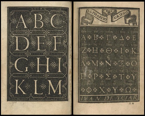

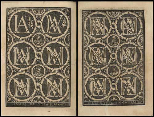

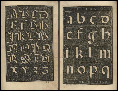
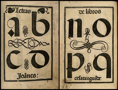
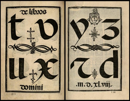
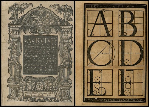
'Arte Subtilissima, por la Qual se Enseña a Escreuir Perfectamente' (The most delicate art of teaching a perfect hand), 1550 by Juan de Icíar (Juan de Yciar) with (?wood) engravings by Jean de Vingles from Lyon is available online from Biblioteca Complutense at the University of Madrid. [click on 'Láminas' in the margin for links to the illustrated pages]
To quote the Britannica Online Encyclopedia:
"From the 16th through 18th centuries two types of writing books predominated in Europe: the writing manual, which instructed the reader how to make, space, and join letters, as well as, in some books, how to choose paper, cut quills, and make ink; and the copybook, which consisted of pages of writing models to be copied as practice.
In Rome in 1540 Giovanni Battista Palatino published his Libro nuovo d’imparare a scrivere (“New Book for Learning to Write”), which proved to be, along with the manuals of Arrighi and Tagliente, one of the most influential books on writing cancelleresca issued in the first half of the 16th century. These three authors were frequently mentioned and imitated in later manuals, and their own manuals were often reprinted during and after their lifetimes.
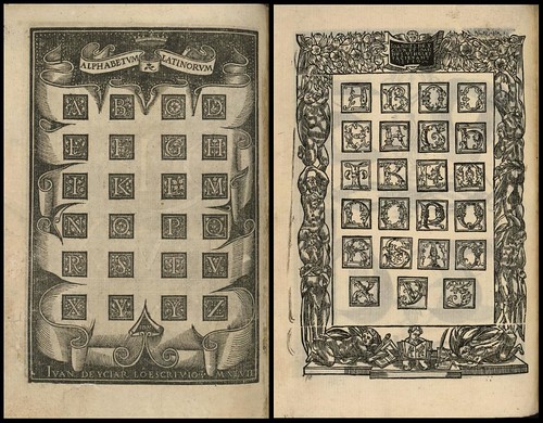
The first non-Italian book on chancery was by the Flemish cartographer Gerardus Mercator. His Literarum Latinarum (“Latin Letters”), published in Louvain, Belg., in 1540, was written in Latin, then the universal language of scholarship; that fact must have increased the work’s appeal to northern European scholars who associated chancery with humanist learning. Mercator expanded on the Italian teaching method of showing, stroke by stroke, how each letter of the alphabet is made; like his Italian contemporaries, he grouped letters according to their common parts rather than alphabetically.
Thus c, a, and d are presented together since they all begin with a common stroke c and are completed with a dotless i or l. His manual goes further than any previous one in presenting the order and number of strokes in making chancery capital letters. (The Italians merely presented examples of such letters to be copied.) Mercator also introduced the 45-degree pen angle for writing cancelleresca, something never suggested or practiced by Italian writing masters.
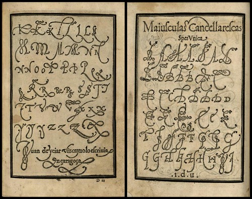
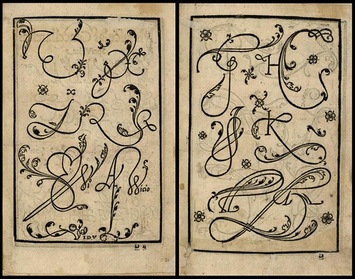
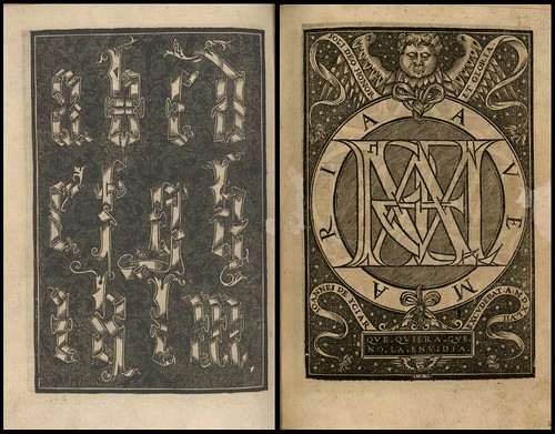
Juan de Yciar was the first in Spain to publish a copybook, the Recopilacion subtilissima (1548; “Most Delicate Compilation”). Two years later he published his Arte Subtilissima (1550; “The Most Delicate Art”), in which he acknowledged his debt to the printed books of Arrighi, Tagliente, and Palatino. Like them he showed a variety of formal and informal hands and decorative alphabets. His manual differed from theirs in its inclusion of advice for teachers as well as for students."
Juan de Icíar (~1520-1590) was a Basque painter and mathematician and the most important calligrapher of the Spanish Renaissance. He settled in Zaragoza where his two calligraphy manuals were published. His 'Arte Subtilissima' introduced the chancery script - cancelleresca corsiva - to Spain and although it is described as a copybook, it is more intended as a manual for an engraver rather than the hand scribe.
I liked a couple of small quotes by Icíar - not out of keeping in attitude towards cursive scripts from some of his contemporaries - from Jonathan Goldberg's 'Writing Matter' (1990) :
"There are some letters so unforthcoming that they refuse to enter into any sort of friendship or conversation with others" [..]
"other letters are naturally amiable and of good concord and do not deny their intimacy to any other letter".
- For a contemporary (true) copybook, see 'Libellus Valde Doctus' by the Swiss Master of Writing, Urban Wyss, from 1549 at the Culture Archive.
- A facsimile edition of 'Arte Subtilissima'
was published in 1960 and includes the original Spanish text and translations by Evelyn Shuckburgh.
- Just because I found it: 'Letter & Lettering: A Treatise with 200 Examples' by FC Brown 1921 is available from Project Gutenberg.
- Typographic resources.
- I've finally added a calligraphy tag to the delicious links {
to benow populatedshortly}.


10 comments :
A wonderful post in both form and content. Who today has time to focus on the curvature of individual letters, or muse about the social interaction between letters? I suspect that writing words by hand, using a quill pen and a bottle of ink, slowed us down enough so that we were compelled to devote more attention to aesthetics every day.
Thanks David! I find that intensely personal relationship to the type form to be thoroughly charming. He could be describing the behaviour of his children.
I'm sure you're right about the quill dipping manual exactness giving rise to the passion and contemplation. But I should think too, that the era - mid-16th cent - meant that people worked in relative isolation, without having a great flow of information, so discovering and taming of a new script, such as chancery/italics, might equally help to concentrate the mind on these inter-letter relationships.
peacay,
interesting the similarity with the work of Portuguese painter Giraldo de Prado (1560)
see: http://briefeankonrad.blogspot.com/2008/08/ein-maler-lehrt-den-schreibern-im-amt.html
Ralf
"There are some letters so unforthcoming that they refuse to enter into any sort of friendship or conversation with others" [..]
"other letters are naturally amiable and of good concord and do not deny their intimacy to any other letter".
Those are indeed particularly fine quotes. I wish I had read them back when I was trying to learn some of this fancy calligraphy (some of which I learned pretty well and some of which just didn't stick at all).
What a fantastic blog. I just linked you up - and I found the above book in a 2nd hand shop recently. Nice to meet another Sydney blogger too.
Breathtaking.
I like the quotes, too -- isn't one form of synaesthesia associating personalities with lexemes?
I always wanted to have synaesthesia. Are you saying I do after all??? (I do agree with whoever it was--Scriabin? who thought the key of C was like white, but I don't see white when I hear C.)
Ralf, they look like they were (nearly) copied from Icíar.
[I must have missed that entry in my feeds; I have toooo many posts coming in sometimes and have to hit the 'mark all read' button now and then to maintain my sanity. It always happens just after I post a new entry here. While I'm getting a post together I have to completely abandon blogs and feeds, sometimes for days, and then there is this monster load of material that backs up.]
Well, I can't say whether or not Icíar was synaesthetic but in that same book I found his quotes are mentions from Mercator (who was also an important calligrotypographer, beyond his mapmaking prowess):
"letters are pure, as when one letter is joined organically to another like a living creature. Others are impure."
and from the Humanist, Erasmus (not sure what, if any, practical role he might have had in the typography/calligraphy field - the book is about hand writing and his name is quoted a lot):
"some letters cannot bear to be joined, others enjoy being close together, and others embrace one another tightly"
But the page(s) preceding these quotes is/are not available in the google books link so it's hard to decipher the full context. There is also the potential vagaries of language associated with the translations. I do think that if you are passionate about something, personification of inanimate objects is a fairly natural way of establishing/cementing/viewing the relationship you have with the constituent parts - letter forms in this case.
{And Hi! AnnaLisa. Oddly enough, I hardly know any Sydney bloggers.}
beautemous. and a whole delicious category tag. yay!
I really like these.
Post a Comment
Comments are all moderated so don't waste your time spamming: they will never show up.
If you include ANY links that aren't pertinent to the blog post or discussion they will be deleted and a rash will break out in your underwear.
Also: please play the ball and not the person.
Note: only a member of this blog may post a comment.