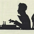
'Schreibmeisterbuch für Herzog Wolfgang Wilhelm von Pfalz-Neuburg' [Cod. icon 466] by Baldericus van den Horick, 1600s is online at MDZ. (Duke of Pfalz-Neuburg's Master Scribe Book)
Pen and ink on paper with writing in Latin, Spanish, French, Dutch and Italian accompanied of course by figurative calligraphy. The catalogue page [trans.] doesn't give too much by way of background information.
About half or a little more of the manuscript images have been posted above. The majority of these have been lightly spot/stain cleaned.
ADDIT (Oct 2012): Baldrick van Horicke at Wikipedia [.Fr] (thanks Fortitou)
Previous posts on calligraphy; and in general: IAMPETH.
skip to main |
skip to sidebar


analytics
Books~~Illustrations~~Science~~History~~Visual Materia Obscura~~Eclectic Bookart.


Custom Search
Contact | Who?
Recommended Blogs
- damn interesting
- metafilter
- gráfica colectiva
- graphic tales
- septentrio
- letterology
- if:book
- hooting yard
- drawn!
- bb-blog
- suzanneG
- recogedor
- agence eureka
- jahsonic
- steamthing
- veerle
- points of departure
- deeplinking
- modern mechanix
- kosmograd
- design*sponge
- everlasting blort
- bibliophile bullpen
- the little professor
- data is nature
- maud newton
- geisha asobi
Blog Archives
Resource Sites
- digital nz
- library of congress
- british library
- library france
- library holland
- library spain
- library portugal
- european library
- library australia
- collections canada
- digital poland
- nypl digital
- botanicus digital
- v&a collections
- britmuseum prints
- smithsonian search
- smithsonian galaxy
- f.a.m.s.i.
- casglu'r tlysau
- rumsey collection
- manuscript catalogue
- digital scriptorium
- cesg manuscripts
- swiss manuscripts
- pecia mss blog
- digital book index
- rare book room
- online exhibitions
- primary sources
- worldcat search
- library directory
- digital librarian
- intute resources
- warburg institute
- lexilogos links
- digiwiki links
- museum blogs
- book arts web
- culture archive
- conservation articles
- art-history timeline
- visual arts
- arts journal
- artcyclopedia
- ukiyo-e
- calligraphy megapage
- penmanship
- woodblock
- coconino
- alchemy website
- health hist. img-banks
- health history links
- history network
- new advent


14 comments :
A remarkable bestiary. Imagine what the calligrapher would have done if called to illustrate some sort of adventure narrative full of animals and exotic characters...
These are magical line works.
What a lovely art form!
Amazing. Having done calligraphy my mind boggles at the skill required to created continuous scrolling in the shape of something and not just for scrolling's sake.
magnificent examples, but a bit bewildering to anyone wondering where to start...
These are wonderful. Presumably produced for an adult audience, you really don't see this kind of whimsy aimed at grown ups very much.
AWESOME. AWESOME. AWESOME.
Thanks for posting this stuff. The internet is a better place for it.
Ah! I concur with what everyone else said.
Oh my goodness! Beautiful! So many calligraphers have copied this style through the ages, and I am grateful to see work from the original era. Getting inspiration at the source.
so beautiful and intricate!
Your blog is a godsend for me as a tattoo artist. so much resource and rare stuff. thank you, please never stop.
Heh, thanks. It's funny, I've had more correspondence about tattoos - one way or another - over the years than about any other broad subject.
It's 'funny' because, although I would not say I'm "anti-" tattoos exactly(and I kind of reject the notion in which only a for or against is allowed), but I would not advocate for anyone to get one and I would try - to some reasonable/modest extent - to dissuade my partner or child from getting one for example.
I find the artwork intriguing to amazing and like to hear how and why people came to get the inking they have, but it's not something that exactly attracts me, per se.
But I also remind myself that my role here is curator and I can't either take credit for, nor be held responsible for, the different ways that people choose to be affected by the material that appears here. I'm much more happy about diversity of effect than I am concerned about people getting tattoos as one consequence of my idle obsession.
For more information on this calligrapher, active in Brussel around 1630-1643, see :
http://fr.wikipedia.org/wiki/Balderic_van_Horicke
Post a Comment
Comments are all moderated so don't waste your time spamming: they will never show up.
If you include ANY links that aren't pertinent to the blog post or discussion they will be deleted and a rash will break out in your underwear.
Also: please play the ball and not the person.
Note: only a member of this blog may post a comment.