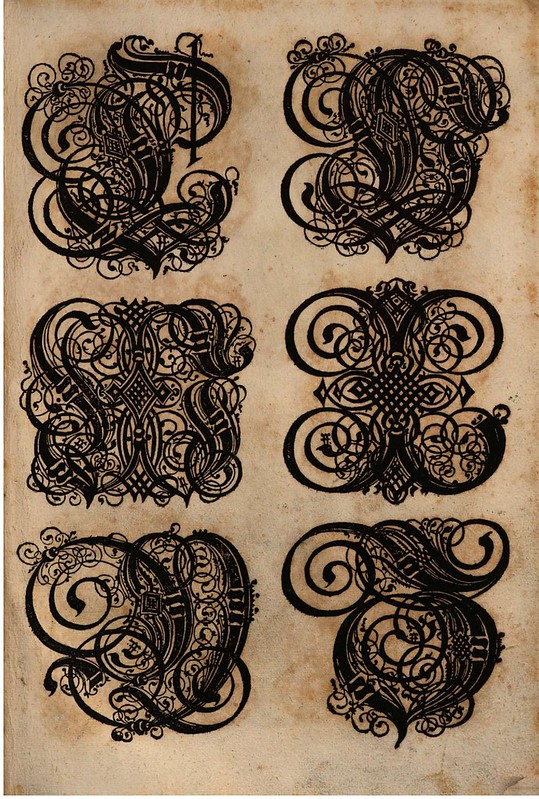
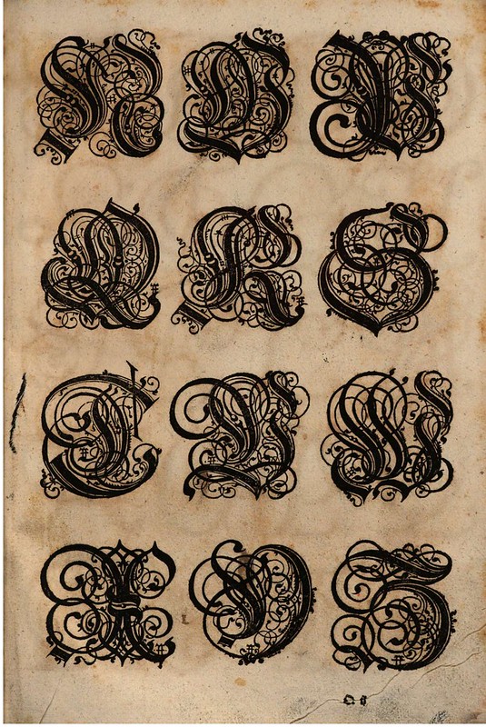
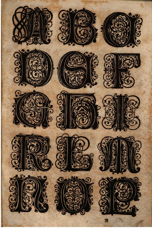
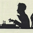
Flamboyant lettering graphics
by Paulus Franck from his 1601 book,
'Schatzkammer Allerhand Versalien Lateinisch vnnd Teutsch'
(A Treasure Trove of Latin and German Uppercase Letters
{via BSB}

In the late 1500s, a Nuremberg publisher/bookkeeper named Conrad Bauer combed through the books from his local region, hoping to compile a selection of elegant fonts. He wasn't particularly satisfied with his findings; there weren't enough stylish scripts around to meet his exacting standards. Although he admired the beauty and geometrical shaping of Albrecht Dürer's Latin fonts, for instance, Bauer thought there was a lack of usable Germanic scripts of similar high quality. And so, what appears to have begun as Bauer's quest to outfit a personal collection of typeforms, evolved from a dearth of suitable fonts into a new book publishing venture.
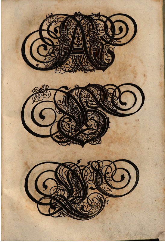
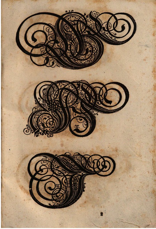
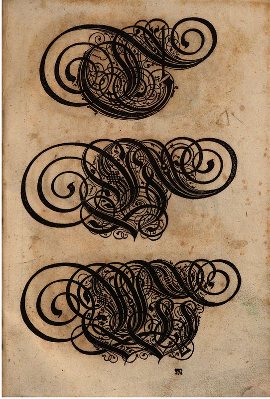
Bauer's intended book, featuring all the alphabetic scripts he admired, soon found financial backing from some local businessmen. The reason for publishing such a book evolved into a desire to teach young people how to use and enjoy distinctive alphabetic forms. Bauer wanted an all-in-one copybook, schoolbook and 'handwriting'-trade modelbook of sorts. A Memmingen schoolteacher - Paulus Franck - joined the project, but it's difficult to pin down with any certainty his role in the enterprise. Beyond the classroom, Franck had a sideline skill with arithmetic, and he would do basic freelance numeracy work for businesses (as a 'reckoner' or 'calculator'), but that skill would be unlikely to impress a team wanting to showcase aesthetic scripts. From the couple of sources reviewed for this post, no mention is made of Franck possessing any specialised artistic talent. Yet Paulus Franck *is* the named author of the book. Perhaps he functioned as project manager and used his teaching experience to ensure the designers and illustrators didn't deviate from the educational aims of the book production? Ultimately, the published book consisted of a title page, a 2-page introduction by Conrad Bauer and approximately 75 pages of decorative initials. I've convinced myself, in those circumstances, that Franck had a more direct role in the illustration design process, so as to warrant his authorship. It's harmless conjecture at any rate. [ADDIT: I am informed that somewhere along the line I have misunderstood some translation or reading. Paulus Franck was known to possess artistic skills and he did indeed produce all the type specimens in the book]
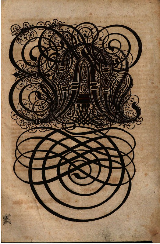
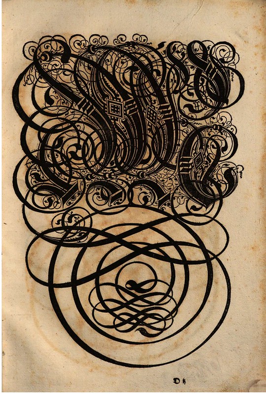
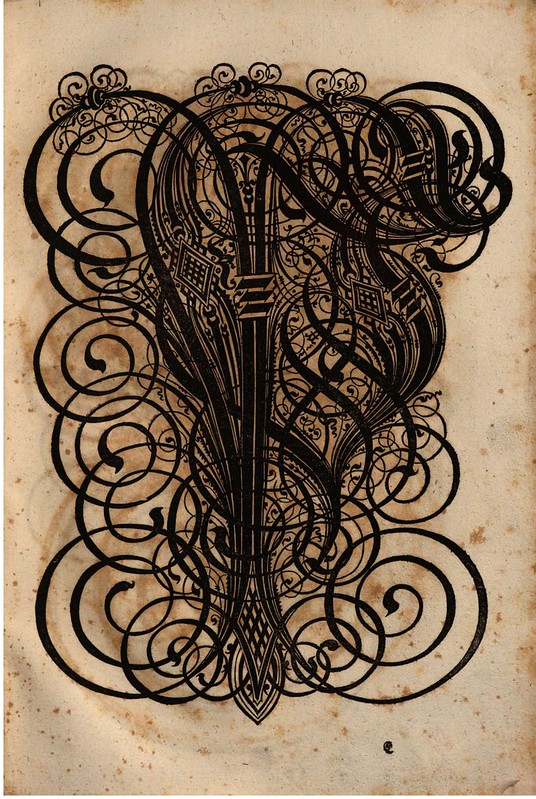
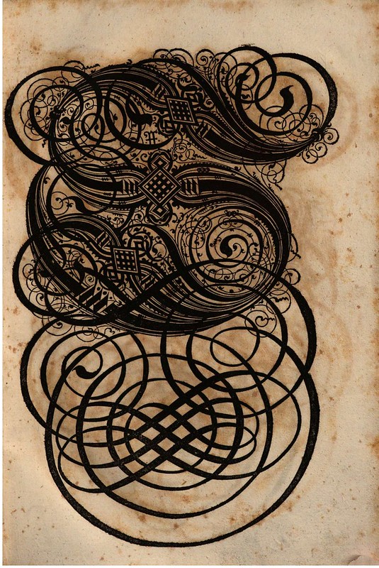
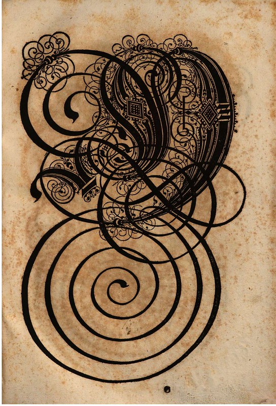
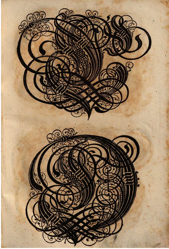
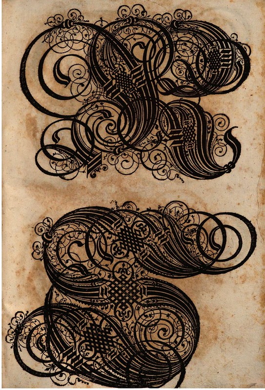
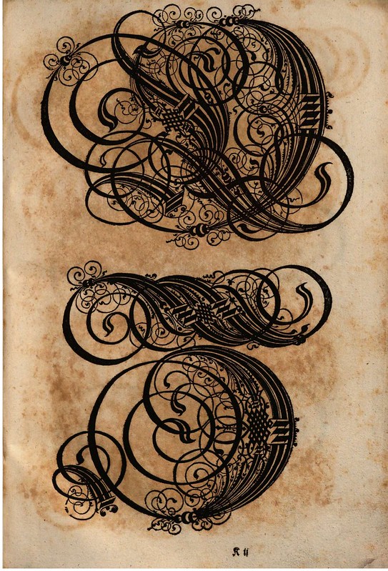
One of the most surprising aspects of the Franck/Bauer book is that the ostentatious letter graphics were printed from woodcuts (produced from carved woodblocks). But that sort of detailed flourish and embellishment is usually associated with copperplate engraving, as far as I've ever seen. A short biography of Paulus Franck, linked within the Bavarian State Library site, specifically names the book's graphical printing system as woodcuts ("Holz geschnitten"). Slight evidence of this woodcut technique is otherwise implied by the lack of plate marks around the printed graphics. The high pressure required to transfer an image from an inked copperplate engraving to a sheet of paper in a printing press, almost always leaves behind marks at the margin of the illustration plate. [engraving is an intaglio printmaking technique where the illustration lines are cut into the surface; woodcuts, by contrast, are relief prints where the illustration lines are raised up and thus require less pressure to force ink onto a page. see: What is a Print?] There's no indication that these images were cropped and remounted which might plausibly hide the plate marks. At first, I believed the overall graphical forms were printed by the popular goldsmith-led engraving technique of the era called blackwork printing (another type of copperplate engraving with deeper gouging and very black line-forms). But they are not; they are woodcut illustrations executed by a superbly skilled print artist.
In the introduction, Bauer provides the reader/viewer with brief notes about the distinguishing features of, and recommended uses for, the seven classes of capital letter scripts that are printed - in order - in the book. (note that the images above are not in the same order in which they appear in the book) The first alphabet features curls and coils and is intended for use in coats of arms and feudal land deeds. The second form bears a doublet pattern of main strokes for use in epitaphs and plaques. The third group - a Gothic style - was intended to be used by scribes in general letter writing. The fourth set comprises easy to learn, wide and short letters, whose application is not stated as far as I'm aware. The fifth group contains a variety of Germanic scripts that can be deployed in many situations. The sixth group is made up of Latin majuscules* (means ~uppercase) in which Bauer appropriated the cursive variant that appealed to him which had been used in heraldic devices by writers in Italy, France and The Netherlands. The final set contained letters for bookeepers to use in margin notes, but the majority within this group was made up of variants of the letters 'I' and 'J', frequently used in legal documents to commence sentences or paragraphs (I = 'Ich' in German, for eg.).
- 'Schatzkammer Allerhand Versalien Lateinisch vnnd Teutsch' 1601 by Paulus Franck was digitised and placed online at the Bavarian State Library about 6 months ago. [a translation of the shortened title approximates as: 'A Treasure Trove of Latin and German Upper Case Letters'.
- I am very grateful for the translation assistance provided by Maren H: this post would not be here if not for her efforts at untangling the Middle German in the introduction and translating the Franck entry at the German Biography site (from an incredibly well-hidden link out of BSB!). If there are inaccuracies in this post, they are likely due to a restricted amount of research material available. I'm sure there is more around, but the ambiguity of Franck's name spelling, translation bumps and general esoteric nature and age of the material amounts to a bridge too far for this website. (but see below for a little contextual commentary) THANKS MAREN!
- The 'Treasure Trove' book has seen something of a revival in recent years. A reproduction of the Franck original was issued in 1998 and the Paulus Franck font (Fraktur, I think) is available from many typography sites for download.
- 'Schatzkammer Allerhand Versalien Lateinisch vnnd Teutsch' 1998 at Amazon.
- Previously: calligraphy.
- This post first appeared on the BibliOdyssey website.
The following quote is edited for context and comes from: 'The Domain of Images' 2001 by James Elkins from Cornell University Press -
"A number of ordinary scripts have been pushed toward illegibility by excessive ornamentation attached to the "outside" of letterforms. A recent example is the German cursive script called Kurrent, which was the handwritten cursive form of Fraktur, the characteristically German "Gothic" style in use through World War II. In Renaissance practice, Kurrent involved fanciful ligatures and - even more of an obstruction to reading - repeated marks that could be taken for the spikes and curls of [some] lowercase letters. The result must have been unintelligible to the untrained eye, as a word such as und (and) might be spelled unndt, and then those letters multiplied by supernumary spikes, creating a nearly incomprehensible shape.
The history of monograms is another instance of calligraphic force applied to letters from the "outside", in this case bending and knotting them into nearly illegible pictorial shapes. In Charles Demengeot's 'Dictionnaire du chiffre-monogramme' (1881), the letters of the name Hyacinthe are bolted, pierced, sawn and knotted around one another, in imitation of wood, paper and metal.
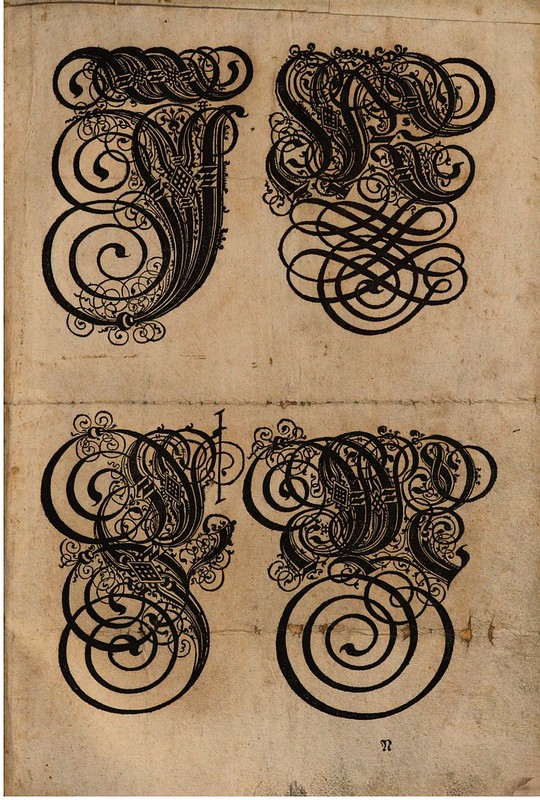
Calligraphy that works from the inside an be even more violent and less amenable to ordinary reading. The renaissance of such calligraphy took place in Nuremberg in 1601-1602, when three closely related books appeared in quick succession, each demonstrating letterforms more intricately fractured than any before or since. Anton Neurdorffer, the most important of the three authors, had to offer his readers step-by-step instructions for creating letterforms; without them his concoctions would resemble birds' nests more than letters.
Another of the authors, Paul Franck, produced an outlandish book of capitals so ornate they could scarcely be recognised - or used. [remarking on one example by Franck seen in the book, our author says:] It helps to think of a German "Gothic" letter M, but even then it looks more like a monstrous thorn bush than a letter. Some of the letters, such as the I, outgrow the book itself and are printed on folding plates. There are several mid-century editions of Franck's book (for eg. Nuremberg: P. Fursten, 1650) all derived from his 'Schatzkammer' ".
[the third author of that 1601-1602 period trio is Christoph Fabius Brechtel: 'Kurtze vnnd getrewe vnterweissung der fürnēsten Teutschen Hauptbuchstaben' (1602) - but there is no commentary on Brechtel in the extract I was able to obtain from the Elkins book]


1 comment :
These letters shown here seem almost reminiscent and as beautiful as Islamic Calligraphy. Each letter seems a picture by itself. It was interesting to read about their uses.
Post a Comment
Comments are all moderated so don't waste your time spamming: they will never show up.
If you include ANY links that aren't pertinent to the blog post or discussion they will be deleted and a rash will break out in your underwear.
Also: please play the ball and not the person.
Note: only a member of this blog may post a comment.