Stylised 17th century floriated letterforms
&
grotesque mask sprinkles


Baroque absurdities or genius ornamental typeforms? Take your pick.
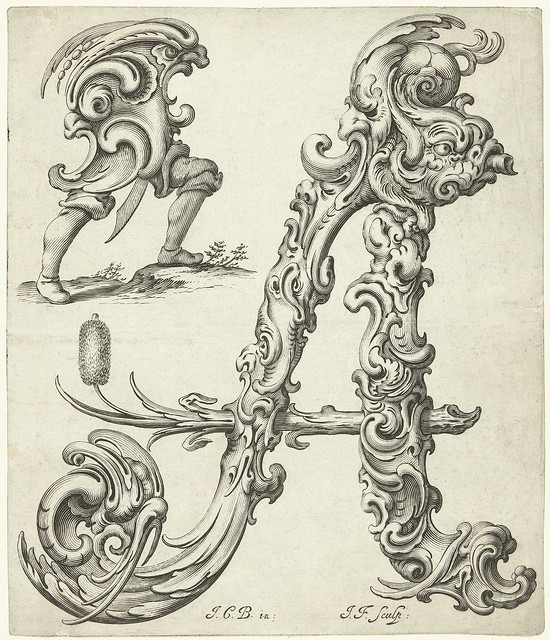
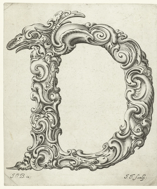
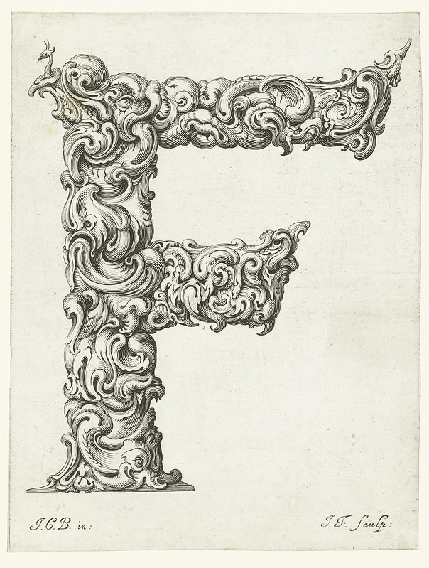
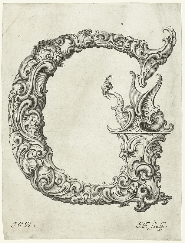
The prints above and below were designed in the mid-1600s by the Polish goldsmith, Jan (or Johann) Christian Bierpfaff (1600-?1690). He apprenticed with the Mackensen family of metalworkers in Cracow who introduced the Dutch auricular ('shell or ear-like')^ style of ornament into the Polish gold and silver workshops.
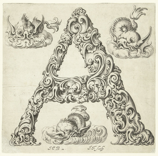
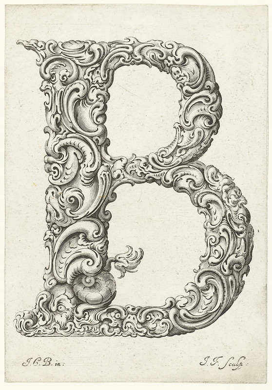
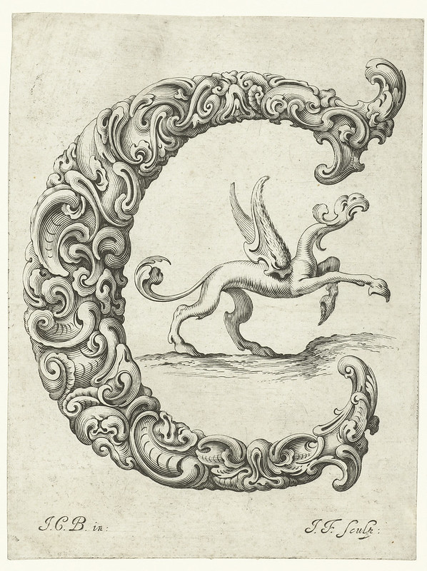
Bierpfaff's organic alphabet (dedicated to the patriarch of the Mackensen clan) blends the newly discovered shell patterns with grotesque botanical styling to produce extraordinary, abstracted figures in which the ornament itself comes to life. These are wonderful and astonishing print designs to my way of thinking. In fact, I'd go even further and suggest that the first image right up the top - the 'A' - is just about the most ingenious piece of printed artwork that that has ever been featured on this site.
The design is whimsical, imaginative and exquisite, all while being restrained within the confines of a recognisable alphabetical form. We see and feel dynamic, emergent shapes of plant and monster life-forms. Glance away and the appearance might change. It is a remarkably 'fluid' perspective. And a bizarre, autonomous child-form stands alongside its presumptive mother; the artist is no longer required. We have achieved self-replicating ornament. Now that's what I call proto-surrealism.
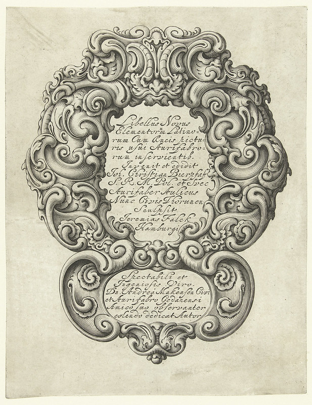
Although the background information online seems a little ambiguous as to publication dates, I believe the series above (released as a suite of 20+ prints called: 'Libellus Novus Elementorum Latinorum..') was the first appearance of Bierpfaff's innovative designs. His fellow-countryman, Jeremias Falck (a renowned artist in his own right), engraved the suite, and it's worth clicking through to see them in a larger format.
The image series below appears to be absolutely identical to the Falck engravings, except for the addition of grotesque masks and similar, odd accoutrements (as well as the text in the title page cartouche). This second suite of prints was engraved by the Strasbourg artist, Peter Aubry.
- An incomplete series of alphabet prints (above) from 'Libellus Novus Elementorum Latinorum' can be found at the Rijksmuseum website. Strangely, I could only find the images via a google image search using Bierpfaff's name {they didn't even turn up searching through the museum site itself for reasons that escape me; some local search poltergeist I assume ---- I can't even find them all now as I'm about to post this entry, so I don't know what I did to find them last week!}
- The majority of images below come from The Art Institute of Chicago and, although modestly sized, I think the collection is approximately complete.
- The two images with double letters each came from MAK^ via Ornamental Prints Online ("Bierpfaff")
- Short bio on Bierpfaff.
- Jeremias Falck at Wikipedia.
- Previously: a few Falck prints appear in Grab Bag.
- Previously: the general bookmark of calligraphy.
- Follow along at Twitter. I'm also using Pinboard for blog summaries AND significant collection bookmarks, in addition to the regular tagged summaries on Delicious.
- LATER: Actually, one very relevant post from late 2011deserves linking here: Satyr Taxis features another (amazing/extraordinary) collection of prints - this time from the 16th century - in which the ornament came to life.


15 comments :
oH NO! There's no J...
Gorgeous
J first appeared in English in about the 1630s, so maybe it wasn't popular enough at the time of publication of these prints(which was about 1656 according to WorldCat). Certainly, I didn't *see* a J in this suite in my travels. You would have been the difficult-to-pronounce Iordi back then!
Great comment!
Well, nowadays it's still difficult-to-pronounce for almost all spanish speakers, not for us catalans
;D
Love your blog!
There's no "j", because it wasn't used in Polish language that time and "y" was used instead.
even Biefpfaff's name is a baroque a go-go oddity!
i'm so glad this was not my first ABC primer: i'd have nightmares.
Ha! Thanks PS, that's a much more rational explanation.
I like to think that I would have welcomed these wonderfully strange little type creatures into my dreams as a child, bowsprite. Of course, it's easy to project bravura from this adult standpoint . You'll have to trust me ;- )
I think you have given the Chicago Art Institute an new exhibition idea from their permanent collection. Thank you for sharing these unique creatures.
These are so beautiful, and the artwork is so amazing, I can even see them in relief! Wonderful, thank you!
Incroyable ! Merci
Incredible!
For some reason the "E" conjured up images of the Great Wave off Kanagawa in my mind.
Love your blog btw.
This pictures are awesome, and I too was sad at the lack of "J" before I read the very interesting comments. Cool.
Re "J first appeared in English in about the 1630s..."
There was a lowercase "j", but for uppercase "J" the "I" (i.e. uppercase "i") was used for both "I" and "J".
Similarly with uppercase "U" and "V" -- both were represented with "V". For this reason, when you come across early decorative initials, you'll pretty much never find the letters "J" and "U" included in the alphabets.
As for another comment that "There's no 'j', because it wasn't used in Polish language that time and 'y' was used instead", that's not entirely true either. The lowercase letter "y" was actually a ligature of two letters, "ij" together -- in fact, you'll even find in some early English books the word "by" written as "bij" (like the Dutch spelling for the same word), and other similar spellings with "ij" where one might see "y" instead.
So that's why -- or maybe I should say "whij". ;)
Thanks for the info Ron.
A site for sore eyes.
Post a Comment
Comments are all moderated so don't waste your time spamming: they will never show up.
If you include ANY links that aren't pertinent to the blog post or discussion they will be deleted and a rash will break out in your underwear.
Also: please play the ball and not the person.
Note: only a member of this blog may post a comment.