Title pages, headings and letterforms clipped, cropped and isolated
from maps and map publications issued between about 1880 and 1920.
from maps and map publications issued between about 1880 and 1920.
"D. A. Sanborn, a young surveyor from Somerville, Massachusetts, was engaged in 1866 by the Aetna Insurance Company to prepare insurance maps for several cities in Tennessee. [..] Before working for Aetna, Sanborn conducted surveys and compiled an atlas of the city of Boston titled 'Insurance Map of Boston, Volume 1, 1867'. [..] The atlas includes twenty-nine large plates showing sections of Boston at the scale of 50 feet to an inch. It is believed to include the earliest insurance maps published by Sanborn.
The success of the Boston atlas and the commission from Aetna must have impressed the young surveyor with the importance of detailed and specialized maps for the fire insurance industry. Following his assignment in Tennessee for Aetna, he established the D. A. Sanborn National Insurance Diagram Bureau in New York City in 1867. 11 From this modest beginning grew the specialized company that has compiled and published maps for the fire insurance industry for more than a hundred years." [source]

Albany, Georgia - April, 1920

Allentown, Pennsylvania - March 1885
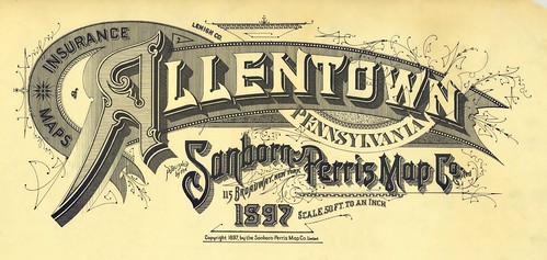
Allentown, Pennsylvania - 1897
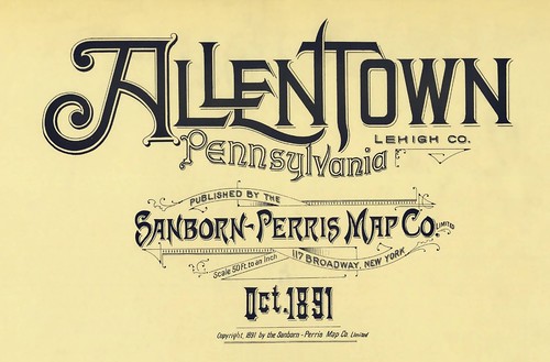
Allentown, Pennsylvania - October, 1891
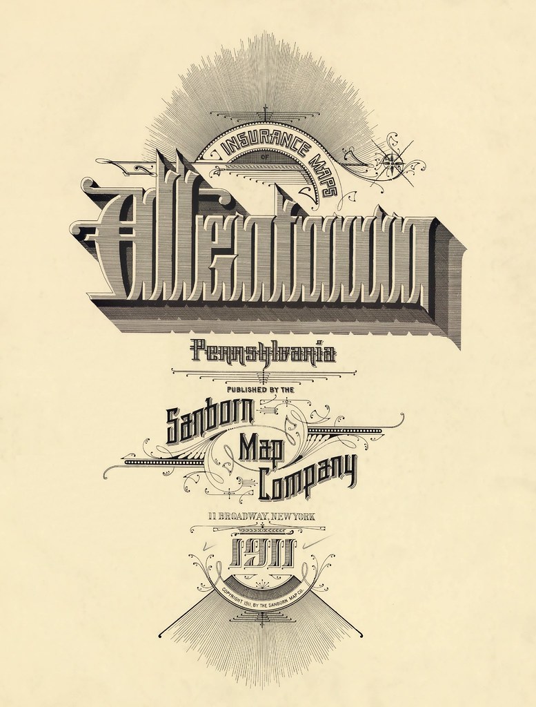
Allentown, Pennsylvania - 1911
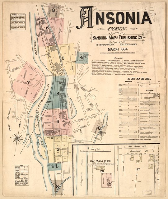
Ansonia, Connecticut - 1884
[example full map]
[example full map]

Aspen, Colorado - February, 1893
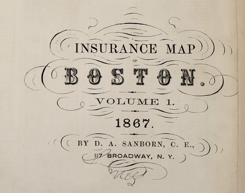
Boston, Massachusetts - 1867

Brunswick, Georgia - July, 1920

Charlottesville, Virginia - October, 1907
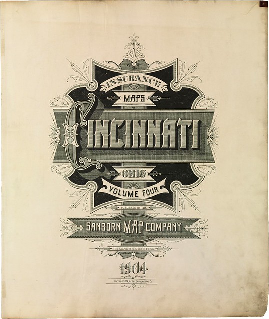
Cincinnati, Ohio - 1904

Colorado Springs, Colorado - 1907
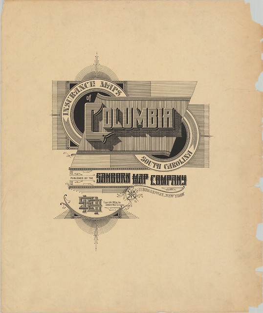
Columbia, South Carolina - June, 1919

Cripple Creek*, Colorado - December, 1908

Denver, Colorado - 1887
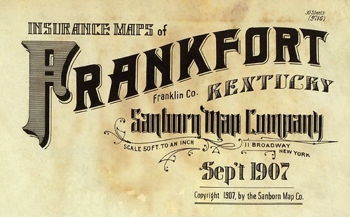
Frankfort, Kentucky - September, 1907
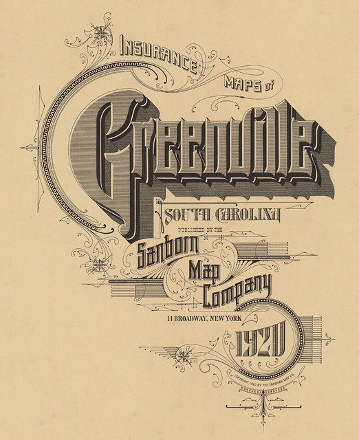
Greenville, South Carolina - June 1920
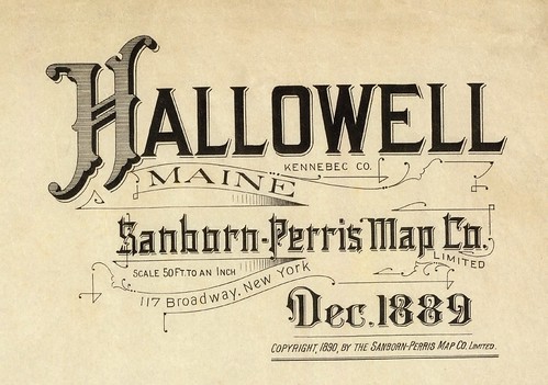
Hallowell, Maine - December, 1889
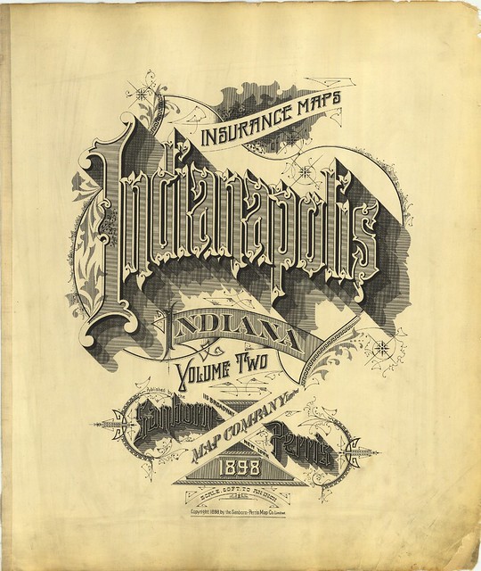
Indianapolis, Indiana - 1898
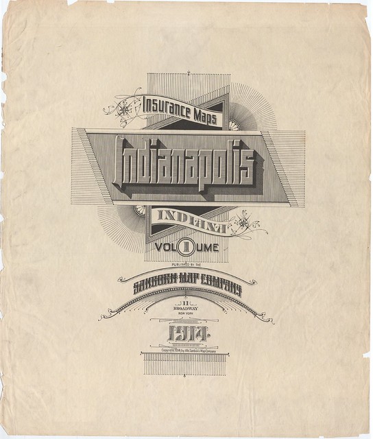
Indianapolis, Indiana - 1914
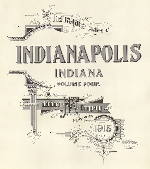
Indianapolis, Indiana - 1915
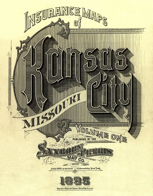
Kansas City, Missouri - December, 1895
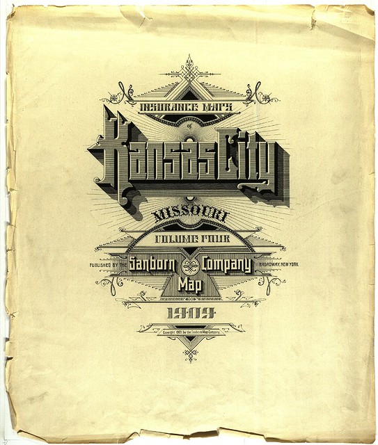
Kansas City, Missouri - July, 1909
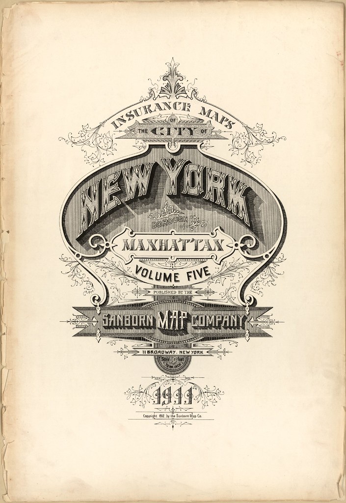
Manhattan, New York - 1911
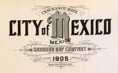
Mexico City, Mexico - 1905
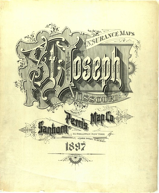
St Joseph, Missouri - February, 1897
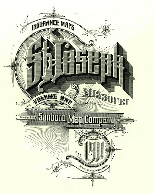
St Joseph, Missouri - September, 1911
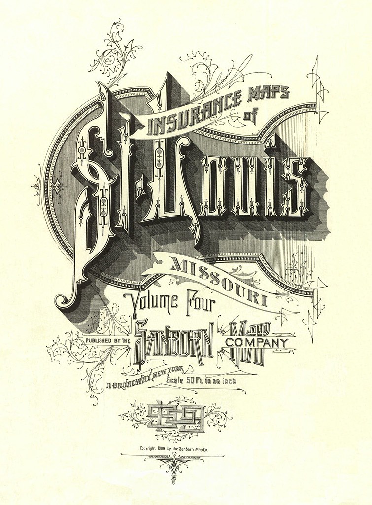
St Louis, Missouri - August, 1909
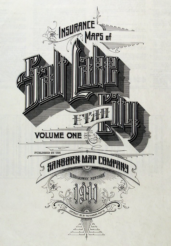
Salt Lake City, Utah - 1911
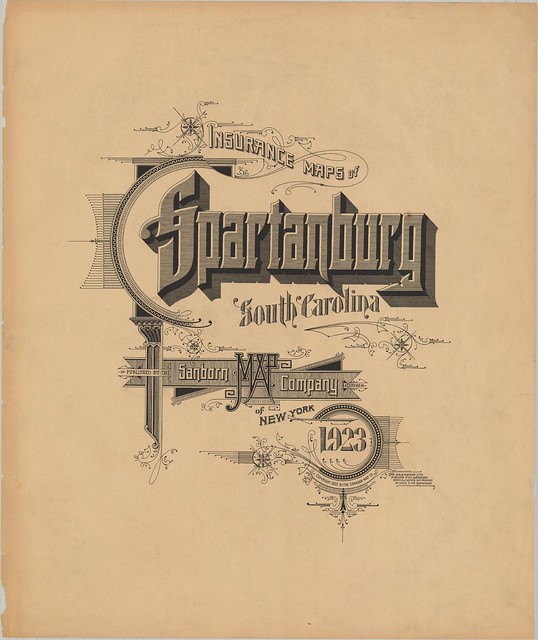
Spartanburg, South Carolina - 1923
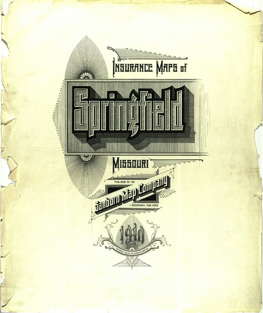
Springfield, Missouri - 1910
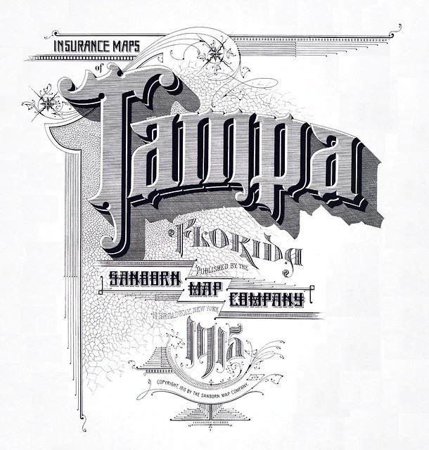
Tampa, Florida - 1915

Thomasaville, Georgia - May, 1920
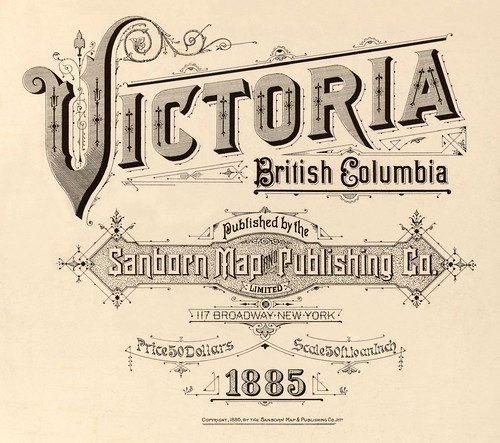
Victoria, British Columbia (Canada) - 1885
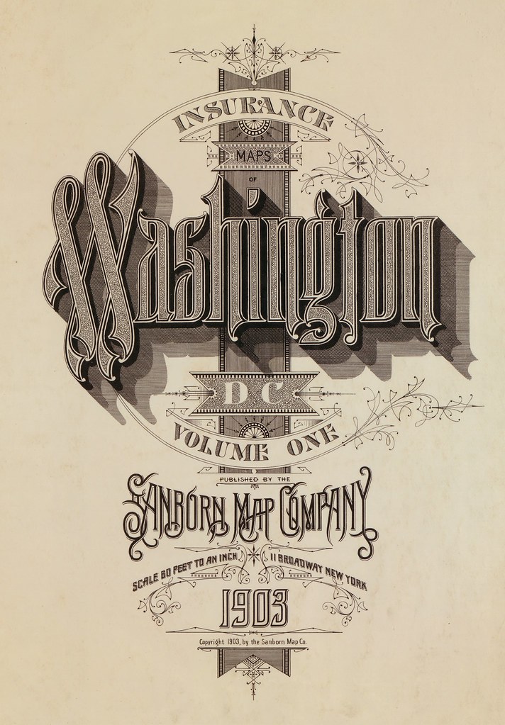
Washington DC - 1903
[Click through for large, and often very large, versions. All images above have been fairly extensively background cleaned of stains, stamps and age-related wear and tear (especially those that remain fairly dirty, following the "less is best" restoration motto)]
Sanborn's fire insurance enterprise produced not only excellent and detailed urban maps, but they also maintained an elegant aesthetic in the headings and legends on the maps themselves, and in the title pages of the (larger) city volumes. The ornamental flair is diverse - I don't think any of the examples above repeat type styles - and lends an air of individuality and refinement to each of the towns surveyed.
Although this sort of artistic embellishment was unlikely to have increased map sales on its own, it's a charming addition which will have perhaps made the purchasers feel a sense of pride and a little more secure about their own unique town. And it's certainly in keeping with the cartographic tradition of decorative trimmings.
There are no comprehensive open portals to the Sanborn fire insurance maps. The images above were obtained from many sources, beginning with the links attached to the Wikipedia Sanborn Maps article.
The Library of Congress has a fairly large site devoted to the subject, but there are only a minimal number of accessible maps.
The LoC collection is, however, available via institutional subscription:
"ProQuest Information and Learning's Digital Sanborn Maps, 1867-1970 provides academic and public libraries digital access to more than 660,000 large-scale maps of more than 12,000 American towns and cities"
In digitising their collection in 2002(which I don't think is available on the open web), the University of Utah outlined their process and included this paragraph:
In digitising their collection in 2002
"Copyright Issues:
No discussion of digital projects is complete without tiptoeing into the quagmire of intellectual property law. The Sanborn Library, LLC owns the largest and most complete collection (over 1.2 million) of historical Sanborn Maps™, and copies from that collection are sold through Environmental Data Resources Inc.9 Prior to beginning our project, Marriott Library Assistant Director for Special Collections, Walter Jones, contacted the Sanborn Library, LLC and requested permission to scan and post all 3,000 maps of Utah in our collection. Permission was denied, and we limited our scanning to those maps in the public domain, i.e., through 1922. There may be hope for scanning more maps, however, as current law states that materials published from 1923-1963 and whose copyright was not renewed are now in the public domain.10
After the digital collection was posted, The Sanborn Library LLC informed us that even the terms "Sanborn" and "Sanborn Maps" are registered trademarks of The Sanborn Library, LLC and that we were required to insert trademark symbols on every occurrence of those words on our website, as well as a statement of that ownership on our main page. We complied."
- Sanborn still exists. They don't follow BibliOdyssey, but maybe you should.
- Previously in a general sense: calligraphy (another of the 'close enough is good enough' tags from the BibliOdyssey delicious bookmarks).


49 comments :
Rrrrright... I too have a difficult time understanding where to draw the line - even with some fonts. I generally can get by with screen shots for the various type styles I really like, no matter where I happen to find them. I don't use them as they are, but rather utilizing the letters that are present, recreate the letters that I need using the same style for the characters.
Wow, this is an amazing collection. Many thanks for sharing!
It should be noted, though, that most of these designs aren't "typography" in the strict sense of the word, and would be more accurately described as "lettering". That is to say, they weren't made using fonts, with pre-designed letterforms. Instead, each letter or word was designed for that exact context, which is how they are able to make them so elaborately ornate and intertwined.
These were most likely accomplished as engravings by someone who was more skilled with drawing new letterforms than they were at arranging existing letterforms. Compare it to the difference between sculpting free-form with clay and building something with a set of Lego parts.
Oh I wouldn't argue with you Nick. The vocabulary for this kind of work is confusing or narrow or esoteric enough that I'm happy using 'typography' as a generalist term in the title. It's less about specificity and more about finding an catch-all expression that everyone can relate to. (it's a lot closer to the mark than 'calligraphy'!)
These are so beautiful, thank you for posting them!
Actually, PK, like Nick said, in type circles you'll be slapped with a trout or something for calling this typography. «Typography» is commonly agreed on to be made with prefabricated letters (vulgo «fonts»), whereas these headlines are certainly drawn especially as such. Yes, calling it calligraphy would be wrong, but trust me, so is calling it typography; even if some of the «100 great examples of…» blogger kids would call it that... They're wrong.
The «catch-all expression» you want is «lettering».
But we are not in type circles here.
*That* is the point. "Lettering" is at best a confusing term. Not for you guys obviously. But for regular people, it's hard to put "lettering" in a blog post title and convey what will be seen.
That's why I mentioned calligraphy --- I use *that* as a catch-all phrase/tag on *this* here blog as short-hand for a whole bunch of disciplines, including ornate lettering.
Ah!
It's probably not an unusual problem, but still a bit sad, if the only way to make something accessible to laymen is to use terminology that is actually, technically incorrect.
How bout helping to educate the masses outside the «type circles»? <:-)
Well, I suppose the comments here serve to help that aim. Anyway, I concede that I could have perhaps titled the post a bit better. But then again, I was a little busy FINDING & FIXING all of these images we see here ;- ) I need an editor and an intern. And a back massage.
Yeah, I should really say thanks for all your wonderful work a lot more before I come here to complain about minor nags. :)
I don't care what you title this post ...thanks for sharing. All I can say is they do not make letters like that anymore. I have a particular fondness for old hand lettered signs that you would find in common stores. They were often as clunky as these print pieces are exquisite.
When I drove through Mexico in 1980 I got car insurance from Sanborn's, as my US insurance wasn't valid over the border. As a service, and no doubt to cut down on accidents, the Sanborn's office presented me with a detailed customized guidebook for my expected route, complete with some schematic maps (nothing like the above) and warnings about what gas stations to avoid etc. I assume it was a successor to the same company. There was also a Sanborn's café in Mexico City but I don't know if they were connected.
These are fantastic! It's really interesting to see the evolution of the company name. I like how the ornamentation in the designs conveys the “feeling” of the town or geographical area - especially for Tampa, Thomasville and Washington, DC. As always, thanks so much for all the hard work in researching, preparing and publishing these posts.
Did you miss
http://content.lib.utah.edu/cdm4/az_details.php?id=0
I used the Sanborn map at the local library when researching the history of my house (built in 1885) - it would have been gauche to stand there salivating, so I managed not to.
It's amazing that even the maps for smaller towns like Richmond, Indiana (well - wasn't so small then) and Rushville, Indiana (which was) were done with the same lovely care.
How many days of an expert's time do you suppose such a title page could have cost?
Is there any work being done (or contemplated) to produce full fonts from any of these?
I just uploaded a set of San Francisco title pages. (I rather like the 1913 edition.)
Typography - the art of spacing and arranging type (letterforms, lettering, typefaces, ornaments, flourishes).
This is ALL about typography. Thanks for posting!
steve
During my time as a student at Pratt Institute, I once stumbled on a set of at least 60 very large format books without any clue what i was about to see. When i opened the first one i stood over the book in shock. I was looking at one of the most beautiful pieces of art i had ever laid eyes on.
They were all Topographic maps of Brooklyn and the 5 boroughs that make up NYC. All dated betwenn 1898 and 1921.
These title pages that you have posted were the same books i had encountered more than 15 years ago.
I finally went back one day and spent 6 hours taking pictures of the title pages and inside pages for my design reference.
I look at these as the educated versions of what graffiti has become today worldwide.
These letter forms are closer to illustrations than to typography. The stylistic expression captured in each stroke is magnificent and i really appreciate you posting these.
Thank You.
I remember posting a few high res Arkansas Sanborn maps a year or two ago on my blog: http://www.arkansawtraveler.com/?p=108
Wow! Awesome collection! Love it!
Did I say, absolutely beautiful!?
Lettering art. Not typography (arranging, not creating) and not calligraphy (writing lettering with a pen or brush).
I'm a working type designer, lettering artist and calligrapher with a shelf full of period books on the lettering arts. Althogh calligraphy falls under the banner of lettering art, all lettering art is not calligraphy. This well established terminology is not subject to latter day opinion.
Thanks so much for exposing folks to this fascinating and quirky period in stone litho printing. The art was very much shaped by the architectural style of the day (Eastlake Victorian and Egyptian Revival) as well as the mechanical process itself. Check out Aaron Horkey's Dead Arts Publishing - he's doing incredible gig posters incorporating these styles in letterpress, screen print and blind emboss media.
Milwaukee titles: 1910 & 1894, via the American Geographical Society Library at UW-Milwaukee.
You can also browse via Google Maps
Wow! These are incredible. Just... wow.
Thanks so much for continuing to prove that the internet is good for something.
Peakay this is truly an outstanding find/collection. I am left speechless. Annoyingly, it beats the fabulosity of similar lettering done for securities (stock certificates and bonds), which is the subject of a new book idea we're currently working on. Thanks a lot ;-)
I find it really interesting that the style of the lettering is definitively 1880s-90s (when you find similar securities engravings) yet they continue here into the 1920s. These would be really old fashioned and fussy for 1923. Unless they were being super-avant garde with revival design— like hipsters referencing 1990s (haha)
About 6 years ago I found these same works for Brooklyn, while living there and going to school in NY. I was absolutely amazed by their intricacy. I did notice however, the "Spartanberg" illumination has the exact same ornamentation as one of the Brooklyns. Is this type of repetition common?
Amazing lettering works from the past engraving masters. This collection is pure inspiration! Thanks for sharing!
Thanks everyone.
Angela, I was thinking of you while I was chasing all these down. After you're done with the stocks (good call btw), you can take up the map accoutrements. I've only lightly scratched the surface in terms of diversity of style I think. There are enormous depths still to be plumbed and you're just the girl to do it!
These are all just gorgeous!
What a wonderful finding! It goes to show that you can find marvelous victorian style lettering and layout in the most unsuspected spots.
As maps moved to a more technically correct source of information, they lost most of the beautiful aesthetics of early cartography. I am glad to see, that at least in some aspect there were still map-makers that held an aspect of that aesthetic touch in their hearts. Great post and well done!
Wow, thanks for posting this beautiful collection. I wonder what the production schedule was like for designs like this.
Dropping by to compliment the post, and to mention what a bunch of asshats they are at the Sanborn Company.
Gorgeous collection of work. Thanks for putting this together and sharing!
Bill R from Fresno emailed to say:
"Hi. I have been studying, and collecting, fire insurance maps for many years. Nearly all of Sanborn's titles after 1905 or so were produced by one man. His signature appears on many individual map pages, as draftsman, beginning about 1884. I have followed his career at Sanborn up to about 1925. In that year he signed a key map page for one of the volumes of Oakland, California."
fantastic! awesome!
some of the finest work that i've seen in my lifetime.
Lettering is superb
Prof. Ed Benguiat
RE: the Bill R. email
"Nearly all of Sanborn's titles after 1905 or so were produced by one man. His signature appears on many individual map pages, as draftsman, beginning about 1884. I have followed his career at Sanborn up to about 1925. In that year he signed a key map page for one of the volumes of Oakland, California."
More followup on this please! Who was the mystery man? The are google searches just waiting to be made!
Mr. Kimberly, I'm afraid I don't know the name and as far as I can tell, it's not going to be revealed easily. I/We can speculate 'til the end of time as to the reason for the (apparent) secrecy, but the upshot is that we probably aren't going to find out via Bill R I don't think. Sorry, I don't mean to be intentionally obscure, but I don't want to speak for Bill R other than to share of his reservations on this topic.
It's amazing to see how much detail they put into this work! I am shocked! Sometimes I think as designers we have to continue to uphold that standard of being "good" at what we do. It's not really about being "different" or purpose to be "unique".
As Paul Rand said, "Don't try to be different, just try to be good."
The Digital Library of Georgia's Sanborn map collection is available here
http://dlg.galileo.usg.edu/sanborn/
(You'll find the examples of Albany, Brunswick and Thomasville there), as well as 130 other municipalities throughout the state.
California:
http://www.sfgenealogy.com/sf/sanborn/sanborn.htm
A San Francisco mag
http://chasingsuninthefogcity.blogspot.com/2010/12/insurance-maps-of-san-francisco.html
Superb!
Thank s to the other who posted more links.
Roger
I believe you could classify these as display types.
These are absolute gorgeous!!!! I love just how bold they were. They used 5-6 different typeface illustrations and it just looks AMAZING!!!
Re: the Bill R email
I don't want to bury this man, I want to praise him.
Having it be the same guy for so long might explain why the later ones look so "old fashioned". But he certainly was a master lettering artist.
Are there any experts who can say what the technique was? I assume stone lithography, but those curly lines look a lot like "artistic typography" of the 1880s, which was done with brass rules.
who cares what about what the technique is called (well, apparently most of you :)), I'd rather know the person's methodology for creating such masterpieces.......!
Desperately searching for San Diego, California Sanborn maps...anything that's archived digitally. Anyone with a link would be doing me a huge favor. Realize it's a long-shot.
Email at: Sub Bass 49 @ yahoo.com
(remove all spaces)
The best places are U Texas, Austin and I would also ask at San Diego University or even at Sanborn themselves. They are scattered all over the place and I don't know that institutions are putting so much online anymore; I think they worked out how lucrative they could be. Good luck!
Post a Comment
Comments are all moderated so don't waste your time spamming: they will never show up.
If you include ANY links that aren't pertinent to the blog post or discussion they will be deleted and a rash will break out in your underwear.
Also: please play the ball and not the person.
Note: only a member of this blog may post a comment.