The original Ornamental Typography post from early last year.
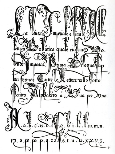


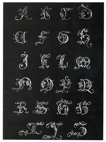

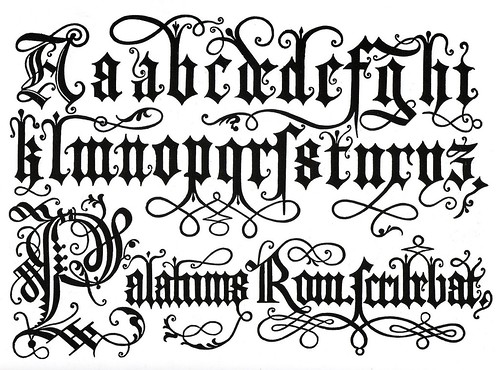


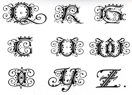


These images were scanned from a 1996 book, 'Ornamental Type' from the Pepin Press stable.
The book has almost no commentary other than to advise that the selection of ornamental letters, monograms and initials included were produced from the 15th century up to the 1930s.
Their alphabets and type designs were fairly obviously derived from microfilm scans (some of the original book/manuscript examples - not seen above - have been posted on BibliOdyssey previously). That's not to say it's bad quality particularly, just that it's more intended as a stylistic reference guide or design inspiration rather than being copybook quality. I have cleaned up most of the background noise in the above images (which would be about 10% of what's in the book, if that).
Previously: Ornamental Typography and in general: calligraphy.







2 comments :
Thanks a lot for scanning these images, for cleaning the background noise and for giving us the chance to delight with these beautiful letters.
Nice job. Thanks for sharing this and all other stuff.
Post a Comment
Comments are all moderated so don't waste your time spamming: they will never show up.
If you include ANY links that aren't pertinent to the blog post or discussion they will be deleted and a rash will break out in your underwear.
Also: please play the ball and not the person.
Note: only a member of this blog may post a comment.