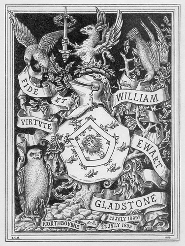
Bookplate of William Ewart Gladstone
Created by Samuel Hollyer, 1889
"William Ewart Gladstone - Northbourne d:d: 23 July 1839 - 23 July 1889," with the motto, 'Fide Et Virtute' features a coat of arms, a gryphon holding a sword, falcons, and an owl. Gladstone, a British political reformer and rival of Disraeli, was Prime Minister in England four times.Created by Samuel Hollyer, 1889
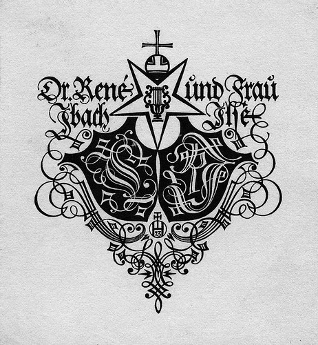
Bookplate of Dr. Rene und Frau Thackstfep [?]
Created by Hans Thaddeus Hoyer, 1923
"Dr. Rene und Frau Ibach Isse" in Gothic script; includes monograms, "FI" and "RI" on shields, with ornamental design. Signed near bottom, "HTH" with "23."Created by Hans Thaddeus Hoyer, 1923
[update: some of this is inaccurate; see flow's comment below]
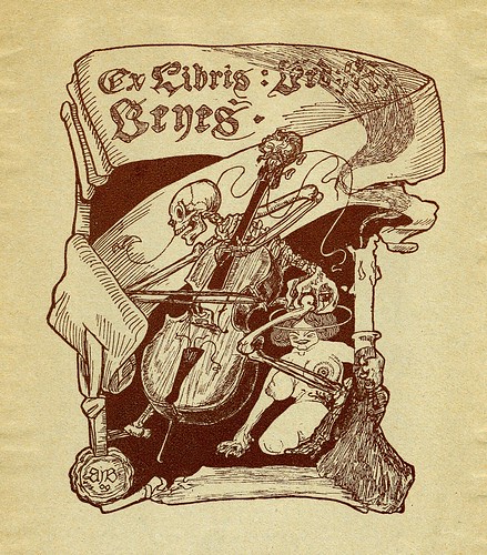
"Ex Libris [...] Benes;" features a skeleton playing the cello and a nude woman with claws. Signed in lower left, "AIB 09." (1909)

"Bucherzeichen Otto Brinckmann" depicts a sailing ship on the ocean. Unsigned.
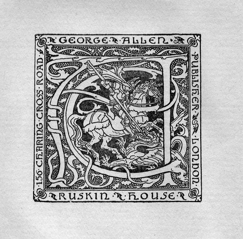
Bookplate of George Allen Publisher, Ruskin House
Depicts Saint George slaying the dragon, with large monogram "GA." Signed in lower right with unidentified monogram.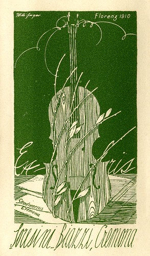
Bookplate of Loresini Biazzi, Cremona
Created by Willi Geiger, 1910
"Ex Libris Loresini Biazzi, Cremona" + "Stradivarius - Cremona" features a violin, probably a representation of the Cremona Stradivarius violin. Signed in upper left, "Willi Geiger;" withCreated by Willi Geiger, 1910
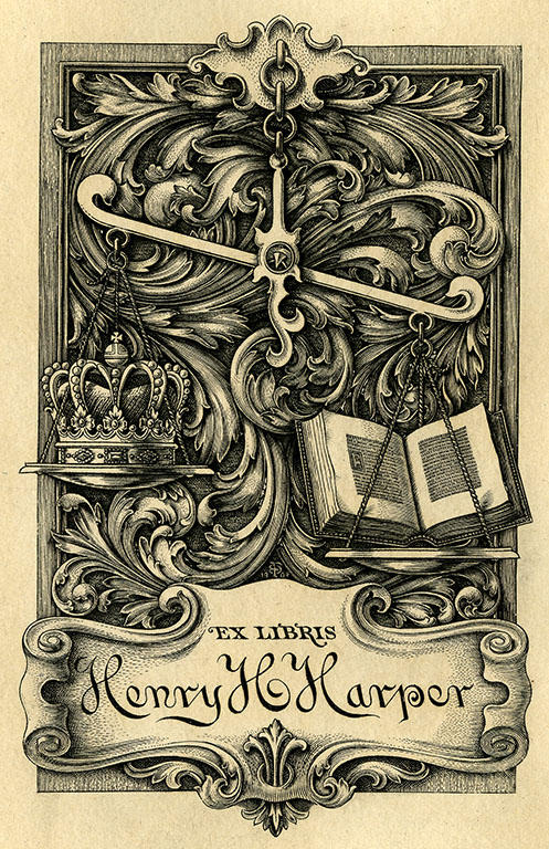
Bookplate of Henry H. Harper
(unsigned, undated)
(unsigned, undated)
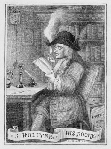
Bookplate of (and created by) Samuel Hollyer (1896)
"S Hollyer His Booke" depicts a library setting with a man at a desk reading a book while burning a hole through his chapeau. In the bottom right corner is a book titled "Hogarth." Signed at bottom right "S.Hollyer Eng."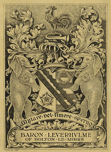
Bookplate of Baron Leverhulme of Bolton-Le-Moors
Created by G Scraby, 1917
Features a shield supported by elephants with roses. The shield bears a rose, garland, vertical and horizontal stripes, a helmet, and a crow (supposedly). The crest features a trumpet and a rooster.Created by G Scraby, 1917
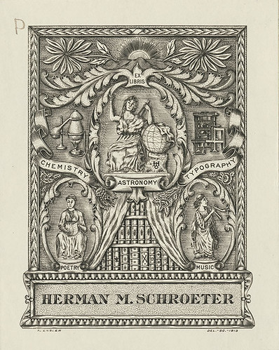
Bookplate of Herman M Schroeter
Created by Arthur Engler, 1913
Includes motto, 'Chemistry Astronomy Typography'; features a woman with globe, a woman with scroll, a woman with musical instrument, a bookshelf, a letterpress and a chemistry set.Created by Arthur Engler, 1913

Bookplate of F Rainis
Created by E.G. Reuter
Features the motto 'Inter folia frucus advor geneuenfis' and depicts a backgroumd of a grapevine design. Signed at bottom "E.G. Reuter."Created by E.G. Reuter
[see flow's comment below]
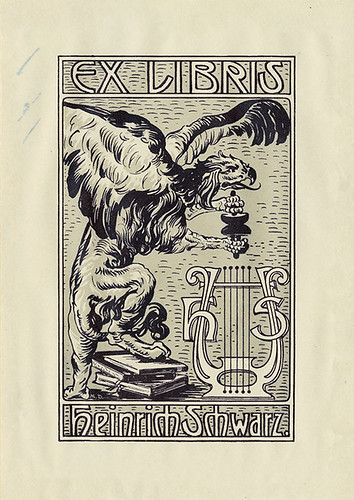
Bookplate of Heinrich Schwarz
Created by M.D.
Depicts a phoenix or an eagle¶ standing on a stack of books and grasping a scroll with a lyre beneath.Created by M.D.
[¶ Addit: Actually, it's a griffin -- "a legendary creature with the body of a lion and the head and often wings of an eagle"-- thanks AWW!]
The Pratt Institute Libraries have a collection of more than 1200 Ex Libris (bookplate) images in their flickr stream.
"The Ex Libris Collection consists of nineteenth- and twentieth-century bookplates from private and institutional libraries. The plates feature finely detailed engraving and etching, and serve as outstanding examples of period book art and typography."The first six images above come from a selection of more than one hundred of the Pratt Libraries Ex Libris Collection posted at high resolution to LunaCommons
[The LunaCommons site - mentioned previously - contains a wealth of cultural material and is a potential (worthy) timesink. Essentially it's an easier way to access images from the family of collections among the LunaInsight browser portals arising out of the David Rumsey site]
Thanks Sara!


19 comments :
adore these, adore marvelous flickr stream link...more brilliance from you, thanks. greatly appreciated.
sorry to nitpick on a great well-informed and entertaining resource like your blog, but i'm afraid you got it wrong on the second ex-libris—it very clearly reads ‘Dr. René Ibach und Frau Ilse’ (or, more correctly, ‘Dr. René Jbach ŭnd Fraŭ Jlſe’, ‘I’ and ‘J’ being indistinguishable in this Blackletter, ‘ŭ’ being the common running hand way to write simply ‘u’, and ‘ſ’ being an orthographic variant of ‘s’).—Likewise, the next-to-last seems to read ‘Inter folia fɿuctus // ExLIBRIS F. RAISIN // Advoc. genevenſis’, with ‘ɿ’ the ‘round r’, in a rather unusual position (it normally appears after letters that have a round belly on the right, like ‘o’, ‘p’), and ‘Advoc. genevenſis’ presumably meaning ‘Genevan lawyer’.
No worries, nitpicking is fine. I of course claim complete innocence, having simply copy and pasted that. I'll make a note. Cheers.
Nitpicking is very helpful, as it enables us to improve our descriptive data. Thank you!
Lorraine Smith
Visual Resources Curator
Pratt Institute Libraries
Well, if we're going to nitpick, that's Beneš on the third one rather than Benes. Looks like there's also a first name hidden in the candle smoke, but I can't figure it out (at least not without more thought than I have available at the moment). Maybe Bedřich? The script isn't the most legible in the world.
Anyhow, the style reminds me of early Kupka but I don't know who AIB is. I'll bet the Ex Libris people at the Památník národního písemníctví do though. They have a huge collection too.
They have a huge collection too.
Tease! Link or it didn't happen.
Aw, I thought I could be lazy and go to bed (5-hr drive tomorrow)...
http://www.pamatniknarodnihopisemnictvi.cz/en/
It's somewhere on there. But I don't know if they've digitized the bookplates at all or just display them in various shows.
Oh I'd found *that* link... I thought you knew where the paydirt was. I do know that bookplate art is/was something of passion in the Czech republic. Come to think of it, most of the best 20th cent. bookplates that I've seen come from Eastern Europe.
Sorry, I was thinking about anyone who wanted to inquire about the artist. Yeah, I thought you knew that link. After all, I used to spend large parts of my life over there (not in the Ex Libris section though--Literary Archive reading Teige and Nezval's mail and all that).
I think they do the Ex Libris shows over at Hvězda, which is singularly amazing building: writeup by present-day surrealist at http://www.universutopia.net/note.asp?L=EN¬e_id=55
The third sample, to me at least, seems to read ‘Ex Libris : Véd : ?i : Veyeś’, where the ‘?’ could be any of ‘A, R, X, H’, and the accent on ‘ś’ could be any accent that goes, in the language concerned, over an ‘s’. I am quite sure it is two upper case ‘V’s, not ‘B’s—typical of this Fraktur type, the open and wide loop indicates a ‘V’, whereas the ‘B’ is written with a stroke that partitions the loop into a top and a bottom half (yes, there is such a stroke, but is purely ornamental and also much too high to turn the ‘V’ into a ‘B’).—Also, the third letter in the second line is a ‘y’, not an ‘n’, as one can tell from the rather thin, bent, and oblong tail that bends to the left. An ‘n’ has a right hand downstroke of standard width that ends, right on the line, in the way displayed by the lower case ‘i’ here.
Flow, I agree that the letter I'm reading as a B looks a lot like a Fraktur V. Certainly, the letters after the colon could be just about anything, apart from that first one. But this is a style of lettering that was pretty common in the Czech lands in the late 19th century (apart from the sex-and-death subject matter, it looks like something by Mikuláš Aleš), and Beneš is a pretty common Czech surname. I guess you might say the whole thing looks very Czech to me and I don't think it's Fraktur despite having some similarities here and there.
Of course, I could be all wrong, but I really don't think so about the Beneš part.
I agree with Karla that Beneš is most likely. If the plate is Czech, a V and a y would be unlikely; I can't think of any Czech surnames that include a y except with an accent at the end. (Then again, perhaps it isn't Czech.) I'd say that the n/y character is an n; there's a similarly 'lazy' downstroke and descender on the upper-case I in the initials at the lower right-hand corner of the plate. I think the downstroke mirrors the atmosphere, particularly the claws of the woman. Bedrich also seems a likely possibility for the first name, or perhaps there's an abbreviated name or two.
My guess is also that there's a pun somewhere in this illustration and name. Just chalk that up to my Czech humor.
> I don't think it's Fraktur despite having some similarities here and there
omg. what do you call this kind of type if not fraktur? grotesque?? sure this is fraktur, and it’s very close to the model, with a few frills.
people, if this thing is indeed czech, which i don’t know, then it was produced right next to germany, and well within a time and place where fraktur, in the form shown here, was the standard bread and butter for around 100m people. they sure had conventions to separate Bs and Vs and ns and ys. to put it this way: should someone be able to conclusively demonstrate that the name in the third piece is intended to spell ‘Benes’ instead of ‘Veyes’ (neglecting the diacritic for the time), then any person will be able to gather any number of typography experts, historians, grandmothers and so on to certify that that spelling, in central europe 1850...1950, would have been considered wrong, just wrong wrong wrong. which doesn’t rule it out, but then—how many artistic but horrendously mal-informed ex-librises to you get in a hot summer? not that many.
the point is you can well come and say ‘hey this looks like the woman’s claws’ (they really are claws, not hands, and i share the observation), but how does that make an n out of a y without colliding with established customs, at the time and place? maybe the person was just as, excuse me, naive as the two posters hereabove concerning fraktur—no offense here, guys, but you for one *would* write Benes the way we see it written here, the n with a naughty claw-tail. BUT you’ll have a hard time in a busy 1909 central european street to find anyone to sell a V for a B and a y for an n. so while the interpretation of Benes cannot be ruled out (as it cannot be ruled out that the letters were, by a crazy designer, intended to be interpreted right-to-left, or as the secret incantation of some strange cult—well that would explain the claws after all!), that would be a singularity. according to occam, i stick to my earlier Veyes reading.
Ah, flow, I really wasn't trying to pick a fight on this, but I do still disagree. As to whether it's fraktur, well, I suppose I'm more used to hearing other styles of letter called fraktur and I don't claim to be a specialist on lettering, merely an art historian who has an unprofessional side interest in fonts and lettering. If you want to think I'm clueless on this, fine. I'm sure you know more about fraktur than I do... I'm just going on having seen and read a lot of Czech stuff from this period.
i don’t want to pick a fight on this either. maybe a second opinion would be helpful. i am so adamant because i have grown up with fraktur and have read and written it so much. i actually often use the german hand as well (see samples on http://de.wikipedia.org/wiki/Schreibschrift; mine is not as elegant tho). if you don't mind have a look at the illustration http://de.wikipedia.org/wiki/Datei:Fraktur_walbaum.png which shows a pretty close match with the type used on the Benes/Veyes ex libris; you can see how V and B differ in that type. because the difference was so small, it was very important not to be made the wrong way. like in ordinary latin letters where l, I, 1 are so similar and can be written as just | a vertical bar, it is very important that *if* you tack one or two extra strokes onto the vertical bar you don’t choose the wrong embellishment. you can prolong strokes of many letters, add frills all you like without necessarily becoming unreadable, but the moment you write ‘full’ as ‘fuII’ or ‘fu11’ people will get confused. that is much more true in continental blackletter, which by design has much more decorative elements than antiqua—but at the same time has so many similar letters (VB, ny, ſf, kl, KR, un, rx... many more) that an uncoming placement or change in stroke length changes one letter to the other. which is, by the way, the reason we have a dot on the i today: blackletter hand has in addition ŭ for u to distinguish it from n, and often a crossed descender in q to better differentiate it from g. hm well, just an ex libris after all. cheers & ~flow
Flow, the Wikipedia link you give shows what I think of as Fraktur, which (forgive me) I don't find that similar to the Ex Libris. I entirely agree that 19th-century German script and printed Fraktur have their own rules and that these letter forms are very different from those used in English. I just really don't see much similarity to the Ex Libris or to Czech fin-de-siecle calligraphy. As I'm traveling at the moment, I can't look up any examples of the latter in my books, so maybe another reader will point to something on the Web.
I decided to look it up in a book of Czech exlibris art, and found the listing: “Exlibris Bed. M. Beneš. zk 1909. 82 : 100. Skelet, hrající na cello.” The note gives the inscribed name (Bed. M. Beneš), identifies the year, medium (zinc engraving), dimensions (82x100 mm.), and the description “skeleton, playing on a cello.” The note is from Bedřich Beneš Buchlovan’s Moderní Česká exlibris: Poznámky sběratelovy (Prague, 1926), which offers an extensive list of Czech book owners and exlibris creators.
Morškýježek's research dovetails with what one of my colleagues has been digging up on his own. I imagine he will want to post his own remarks about it, but he was hot on the trail of Bedřich Beneš Buchlovan (regarding whom see http://www.knihovnabbb.cz/en/about_library/history/buchlovan) just before leaving home for a conference.
Morškýježek, does the book give the artist? I could only find one Mánes member with the right initials/active period. I don't know who was in Umělecká beseda or other groups around that time. Unfortunately the UC Berkeley library doesn't seem to own the book, although UC has some of the author's other works.
I didn't realize what I was stirring up. But the Beneš ex libris kept spurring us on to locate yet more information, so although we're still waiting to get some interlibrary loan books, three of us wrote up a little piece about our investigation.
Post a Comment
Comments are all moderated so don't waste your time spamming: they will never show up.
If you include ANY links that aren't pertinent to the blog post or discussion they will be deleted and a rash will break out in your underwear.
Also: please play the ball and not the person.
Note: only a member of this blog may post a comment.