**This cross-posted collaboration features an attitudinal stimulus package by David Apatoff of Illustration Art with peacay of BibliOdyssey on image wrangling and cattle prod detail.**
Hubert François (Burguignon) Gravelot (1669-1773) trained in Paris as an illustrator-engraver under François Boucher and came to London in about 1732. He was friends with William Hogarth and they both taught at the St Martin's Lane Academy, something of a precursor to the Royal Academy. Thomas Gainsborough was known to have studied under Gravelot.
From France, Gravelot brought with him the ornate styling of the rococo, which he helped promote in his thirteen year sojourn in England. He contributed designs for goldsmiths, furniture makers and the commercial print trade, but his book illustrations - for luxury editions - were particularly influential. He illustrated Gay's 'Fables', Shakespeare and Dryden, and was one of the first artists to illustrate the novel, designing engravings for Richardson's 'Pamela' and Fielding's 'Tom Jones'.
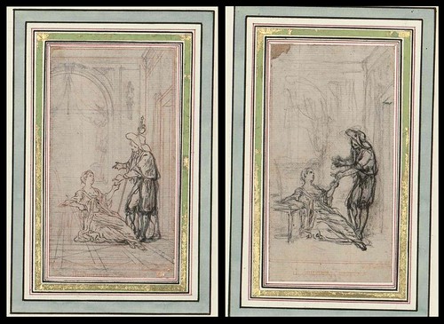
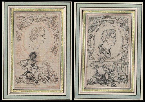
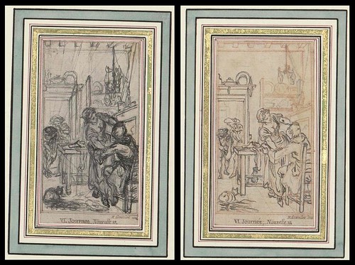
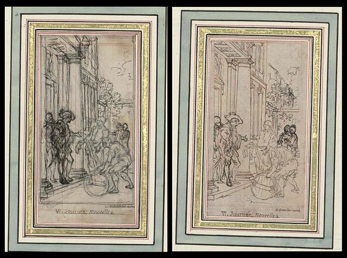
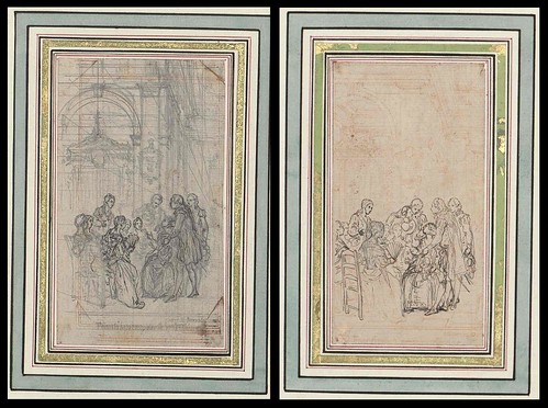
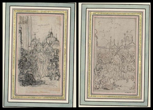
Of the ten images below, the first eight were preparatory sketches for the 'Decameron'; the second-to-last from a Voltaire compilation and the final image is from an unnamed collection (links at the end of the post).
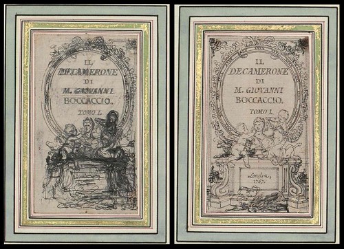
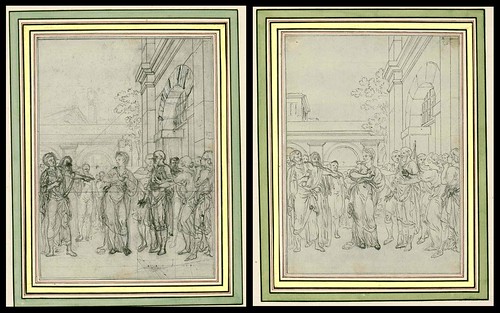
I've been told that one way to measure the quality of an oriental rug is to count its borders. Generally, the more borders around the rug, the more complex it is, and the higher its quality. But I usually find the opposite to be true of drawings: the more fancy borders required to make a drawing look important, the weaker the drawing tends to be. The owners of these Gravelot pictures have surrounded them with up to 14 borders and embellishments (some of them in gold) before you finally hone in on his drawing. Even then, we're not done. Gravelot encircles some of his own drawings with yet another ornate border-- a decorative wreath bedecked with the tools of the arts and sciences, or the symbols of the theatre, or fawning muses overwhelmed by the brilliance of what the reader is about to behold. By the time you finally get through to the drawing itself-- the image at the core where the artist demonstrates what his hand and eye and imagination are capable of-- the viewer has some pretty high expectations.
Unfortunately, I don't see a whole lot here to suggest that Gravelot's drawings satisfy those expectations. These are light, capable drawings. I can understand people preserving and studying them for their significance to the history of the engraving arts, or the manners and customs of his day, but not particularly for the quality of the drawing. Unfortunately, the quality of the drawing is usually the part that interests me the most.
When Gravelot was drawing these pictures, his artistic choices were limited by the fact that the drawings would have to pass through a cumbersome engraving process that was already more than 300 years old. First, the drawing would have to be transposed onto a wood block or metal plate. Next, the plate or block was turned over to an engraver who attempted to carve the image into the surface using sharp and unwieldy tools. This process effectively prevented an artist from drawing in certain styles; Gravelot could not get too spontaneous or fluid with his line, or use half tones in his picture. Finally, the printed picture ended up as a mirror image of the artist's original drawing. The result of this arduous process was a picture several stages removed from the artist's concept.
The artist had to start out with a drawing that would be compatible with the engraving medium and robust enough to survive the deflavorizing process. For example, Gustave Dore was justly famous for powerful compositions that remained lively and strong throughout the engraving process.
Because Gravelot was both an artist and an engraver, he probably had more insight than most into what types of drawings would translate well into engravings. In addition, his engravings probably ended up closer to the artist's original intent than many other engravings (which were often signed by both the artist and the engraver.)
Not long after Gravelot died, photoengraving replaced engraving as the technique for reproducing art in books and magazines. The new technology set artists free and transformed the entire field of illustration. Delicate nuances in line, subtle gradations in color, detailed images were all reproduced with much greater fidelity, permitting artists to do their very best.
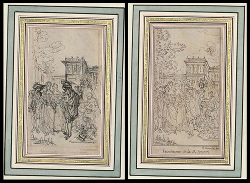
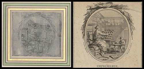
Gravelot may have played an historically significant role as a designer and engraver, but his drawing seems pretty anemic to me. You can see from these preliminary studies how often he has to go back to re-work simple figures he should have been able to visualize and lay out straightforwardly. [title page, outside crowd scene]. Note how tentative his line work is, and how heavily dependent he is upon mechanical tools such as the grid for his vanishing points. [kitchen scene, Imprimerie] Most capable artists could simply intuit perspective in drawings this small, with subjects this simple, but Gravelot's preliminary drawings seem to reveal a well deserved lack of confidence.
One of the purposes of an illustration is to help stretch the reader's imagination by providing an artist's vision of the story. It is ironic then, that illustrating a book as bawdy and rich as the Decameron, we are presented with such wan and lifeless drawings. It's hard to imagine that a reader could not do better on his or her own imagination. These illustrations seem to serve as a visual chastity belt, keeping our minds within legitimate boundaries rather than titillating and unleashing them. There is no commitment or emphasis here, no urgency or merriment in the art to correspond to these stories. By today's standards for illustration, this work seems like a real mismatch between form and content.
- 'Drawings for the illustrations of Boccaccio's Decamerone' {Rosenwald 1645} [book published in 1757].
- 'Théatre de Voltaire; dessins par Gravelot' {Rosenwald 1604} [book published in 1768]
- 'Original Drawings' {Rosenwald 1657} [undated]
- Biographical material: one; two; three.
- Art works: one; two; three; four; five.
- Update: Et en français: 'Gravelot' par les frères Goncourt (this beautiful essay is mostly way beyond my modest comprehension abilities but it's definitely an appreciation rather than a critique) Thanks Florizelle!


9 comments :
Should this be titled "I hate Gravelot"? (What sort of cattle prod was DA applying here, anyway, and why?)
Well, I agree the drawings aren't that exciting, especially as accompaniment to the Decameron. The frames are definitely needed to spice them up. But they'd be pleasant enough as interior design accents. Scattered around the hall or in the bathroom.
Are you sure about photoengraving coming in shortly after Gravelot's death, though? I'm always weak on printing technologies, but isn't wood engraving really the main thing for book illustration during most of the 19th century up until things like chromolithography come along? I'm thinking of all those patient engravers sitting around with their pieces of boxwood preparing scenes for mid-century illustrated magazines like Harper's and Frank Leslie's.
Karla, the transition to photoengraving took place in two stages during the 19th century: first, we learned how to transfer the artist's drawing to the woodblock photographically. (That kept your "patient engravers" employed.) Then in the late 1870s, full blown photoengraving (which ultimately put your engravers out of work) began. Harper's was using high quality half tone reproductions by 1900.
I take your point about being a little rough on ol' Gravelot. "Interior design accents" to hang in the hallway is the perfect way to describe them, and kinder too. I adore so many of the pictures on Bibliodyssey, it's odd that pecay and I ended up doing a cross-posting on this particular artist. But the positive side is this: look at how printed illustrations have improved over the years. Gravelot would never find work in today's market, but due to improved technology and cultural changes, a lot of fabulously talented artists are putting great artwork in the hands of the proletariat for very little.
Thanks, David... I can always use improvement on my print-techniques history knowledge, which is terribly spotty (probably moldy in fact, or at least foxed). But given that photography wasn't invented until Niépce in 1825... well, I'm no better at history of photographic techniques so I don't know about the introduction of photographic transfer to the woodblock other than that it seems it must have been awhile after Gravelot, although this is purely nitpicking on my part due to my demented and random curiosity.
As for improvement in printed illustrations, I don't know I'd argue for either improvement or decay; different periods just have different forms of excellence, although it's true that some periods have more excellent book illustrations than others. In fact, just yesterday a colleague and I were talking about how while there's wonderful illustration out there today, fewer books seem to be done with illustrations than when either of us were growing up. Then again, we're not exactly out there studying contemporary illustration, just looking in the bookstores now and then.
"I usually find the opposite to be true of drawings: the more fancy borders required to make a drawing look important, the weaker the drawing tends to be."
[grin] As an art student, one of my tutors very helpfully advised me that:
"You can get away with murder if it's mounted nicely"
I don't know if you do these cross-posted collaborations often but I seriously enjoyed this post. In my humble opinion, collaboration with the right partner(s) always renders a richer result.
Thanks EA. I think this is the first 'real' collaboration, although different levels of consultation occur in the background quite often. I told David that a once-a-year(!) post like this might be good (even with the most cooperative partner - as here - it is still a considerable amount of 'work' to get it together: I'm not complainin', just notin' the reality of the requisite back & forth). But I rule out nothing.
A very comprehensive book on Gravelot: http://archive.org/stream/gravelot00salouoft#page/n0/mode/2up
I have two Gravelot engravings for which I've been trying with no luck to identify and value - Danse and Euterpe.
I think his engravings are very impressive, considering that many of them were not his own vision, but that of the author. One in particular dictated every minute detail of the scenes that he wanted to illustrate. Those came out somewhat "flat".
I know as an artist, that if (and when) I'm restricted by someone else's micro-management, my work doesn't come out well. But, gotta pay the bills. :)
(as far as the framing and (in some opinions excessive?) borders, at that time they added value to the works. Especially engravings.)
So, 4 years after the last post I find this blog. If anyone does end up reading this, I'd love info on how to price my (beautiful, in my opinion) color, framed engravings. Or just information about specific works, not just artist info... I've found all the information I can absorb about ole Hubert. :)
Thanks Elizabeth. Good thing the bio on Gravelot is online: I see there were only 100 copies published in 1911. And if the Worldcat entry is complete there was only one reprint in the early 1960s.
On the engraving ID front, my first thoughts would be to approach the major galleries (some will take emails with attached pics) or perhaps do some digging to find any Gravelot academic specialists out there. These, in turn, might be able to point you on to the right auction houses, although you might want to set up some google search alerts on things like 'gravelot auction' and 'gravelot exhibition' or his full name for instance. There's quite a depth you could go in terms of approaching people and setting up elaborate ongoing searches that c/should prove fruitful, I'd expect, over a time. Good luck. I have no clue.
I quite liked this post although it was unusual fodder for which to seek some commentary from David! I, myself, always liked the contrast in form and ideas between the sketch and the engraved product (not to mention the unusual 'interior desing' styling); whereas, for David: "..the quality of the drawing is usually the part that interests me the most..". Vive la différence!
..where: "unusual 'interior desing'" is of course "unusual 'interior deSIGN'"..
Post a Comment
Comments are all moderated so don't waste your time spamming: they will never show up.
If you include ANY links that aren't pertinent to the blog post or discussion they will be deleted and a rash will break out in your underwear.
Also: please play the ball and not the person.
Note: only a member of this blog may post a comment.