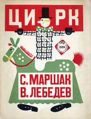


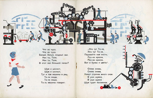
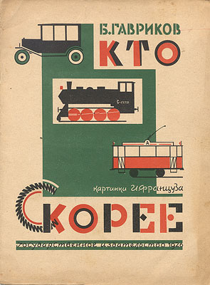
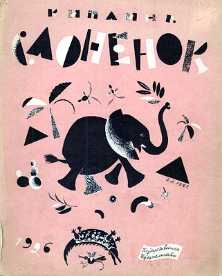
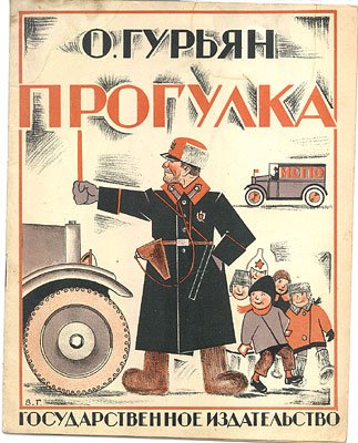
The International Institute of Social History in Holland have a display of covers from 54 childrens books from the Soviet era of the 1920s and 1930s - in some cases they have another page from the book as well. There are also 2 fully digitized books available.
Previously I posted a couple of examples from McGill University's exhibition and I think there are only a couple of repeated images in the Dutch site. The author/illustrator/year are in each of the above URLs. Excellent stuff.
Inadvertently via boynton.
Friday, March 17, 2006
Soviet Childrens Books Part II
Josef Váchal


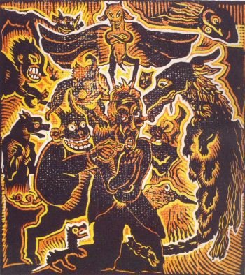
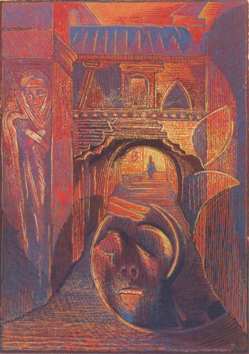
Josef Váchal (1884-1969) was a Czech printmaker, graphic designer, writer, painter, wood carver and bookbinder.
"He published books using hand-made paper in print runs of one to twenty books. Apart from books he also worked at free-hand drawing, especially coloured woodcuts, painting, decorations for ceramics and woodcarvings for furniture. The ideas behind his writing and creative work oscillate between deep and informed respect to baroque book production, shopkeepers' poems and folk 'bloody' novels of the 18th and 19th centuries, and an interest in oriental religions and philosophy, theology and demonology."Váchal was friends with another printer, Josef Portman from Litomyšl who commissioned Váchal to paint murals in Portman's house. Despite Váchal being hounded for his anti-communist beliefs, the house was saved and restored as the Váchal Museum and is referred to as Portmoneum.
- Most of the images here come from the Czech Gallerieart site and thanks to RaShOmoN for posting about it.
- A couple of the above woodcuts were taken from the Josef Váchal website - it's in Czech but there are examples here of some of his other works - paintings, handpainted books and the like.
- These sites display photographs of the inside of the amazing Portmoneum.
Thursday, March 16, 2006
Hans Traxler

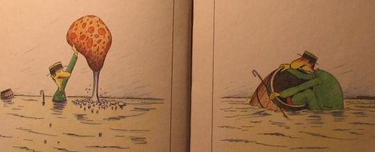
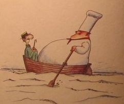

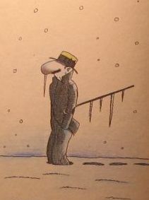
Czech-German Hans Traxler (1929-) has been a lithographer, political cartoonist and comic creator. Despite the flash interface, the poor lighting of many of the pages and the occasional blurry shot, there is something of the Clouseau/Pythonesque/Poirot whimsy that appealed to me about Traxler's 1983 book La Aventura Formidable del Hombrecillo Indomable (Spanish translation obviously - but there are few words).
[via Puño]
Wednesday, March 15, 2006
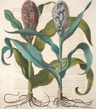
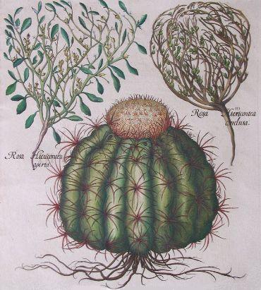
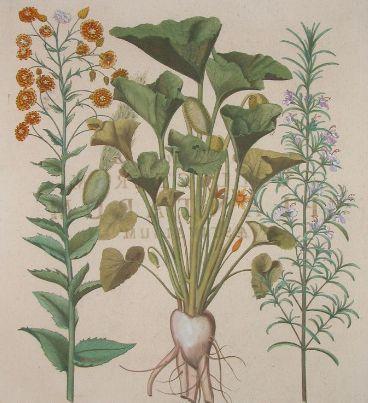
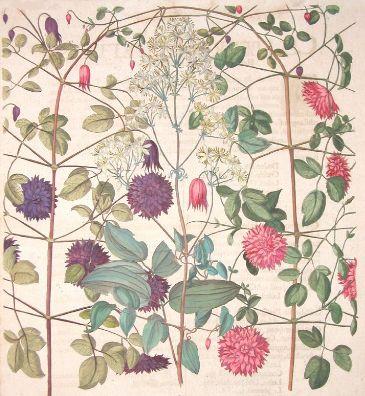
Hortus Eystettensis
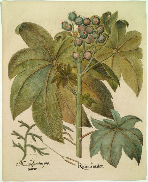

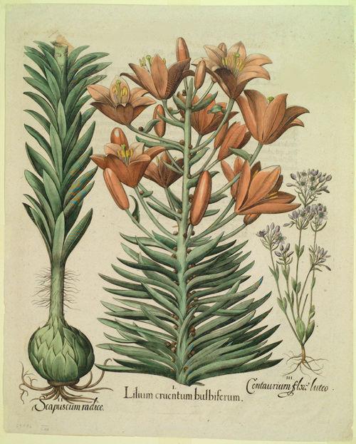
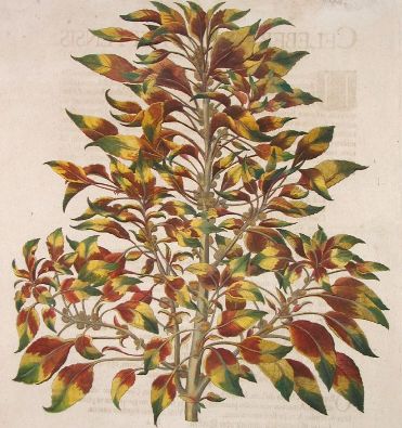


The Bavarian Prince Bishop of Eichstätt rebuilt an ancient palace on a hilltop in the late 16th century near Munich. Surrounding the Willibaldsburg palace he employed Joachim Camerarius to plant a garden covering about a hectare (2 and 1/2 acres).
Camerarius died soon after the project began and was replaced by Basilius Besler, an apothecary and botanical specialist from Nuremburg. Besler was instrumental in choosing and nurturing a wide collection of flowering plants, including specimens from the Americas, Africa and Asia in addition to European plants. By all accounts it was a magnificent garden and was one of the first botanical gardens established outside of Italy.
It seems the Prince Bishop made some sketches and asked that Besler have them engraved. Thereafter, for (up to) 16 years, Besler extended the idea and devoted his energies to producing the most extensive florelegium known at that time, which is still regarded as the finest botanical book ever produced. With a team of 10 engravers, large folio engravings were made, allowing the prints to match the size of the specimens in many cases. My understanding is that Besler himself did some of the engraving, but he was certainly the driving force behind the undertaking.
The book was published in 1613 (the year following the death of the Prince Bishop). Over 1000 plants were illustrated on 350 pages. A black and white edition included notes about the plants for apothecaries, whereas the more expensive hand coloured edition (300 in the print run with colouring done by Georg Mack) included the illustrations by themselves. Although the images were nearly true to life, a concession to the prevailing baroque aesthetic resulted in some embellishment appearing, such as in the traditional portrayal of the root system.
Beyond the artistic and printing qualities of this work, it ironically prefigures the Linnaean system of binomial naming of species with Besler assigning dual names, according to the seasons - the former phenomenon is more to do with luck but in the case of the latter, it was a significant attempt to marry up the scientific attributes of plants with a classification system. Indeed, the book is divided into four parts, one for each of the seasons (it has been known as 'the book of seasons' in some circles). The latin title, Hortus Eystettensis, translates as ‘The Garden at Eichstätt’.
To the best of my knowledge, no complete copy of this book has been posted onlineUpdate below. The majority of the above images (apart from the first 3) were found on the Bergbook (commercial) site - I believe they have the most interesting specimens, but it's debatable. They have a flash zoom interface so I had to rely on slightly truncated screen captures.- The first 3 images above are from the Italian Abocamuseum site which also has perhaps 50 or 60 example illustrations.
- The Arader Gallery site has about 80 images in thumbnail format.
- Further examples are hosted by Glazer Gallery.
- The best background information comes from the British Library.
- In passing, I noticed that a single original page from this book fetches ~$US4000 so it would seem a bargain to pick up a complete and annotated (slightly smaller than folio) volume from Taschen Books for $US50 (I couldn't readily see a date for this publication - in 3 languages).
- Incidentally (or perhaps, significantly), the original gardens were destroyed in 1634 by invading Swedish troops but, with the help of the Hortus Eystettensis, a reconstruction was undertaken during the last decade and the gardens were reopened to the public in 1998.
- UPDATE (July 2010): Botanicus has just digitised a b&w version of Hortus Eystettensis.
============================================
I'm in Canberra at my brother's house at present and am enduring some impediments to my usual posting frequency.
The troubles (!!) with the wireless network alone have curbed my usual online habits, but when this is coupled with the sideline [enjoyable] surfing I've been doing as a guest contributor in March at Coudal Partners and more significantly, with the house break-in and burglary of a laptop (among many other things) from my brother's place and the resultant competition between various university/school student relatives for the remaining internet access...well, as you can imagine, it's quite difficult getting a post together, for which I apologize.
Hopefully this situation will pick up as my intimidation tactics against the smaller and weaker of my relatives become more successful ;- )
Pierre Ouvrard Master Bookbinder
"To speak about the bookbinder Pierre Ouvrard is to examine the vision of a passionate monk, a man who could have been born during the period described by Umberto Eco in his novel The Names of the Rose. While roses attract us with the charm of their fleeting beauty, a fine binding captures for the ages a vision of immortality."
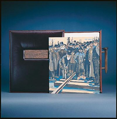
 Steel and Steam R. F. M. McInnis 1985
 Écritures-ratures Francine Simonin 1986
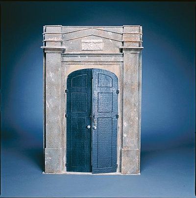
 Hôtel Francine Lavoie 1988
 L'art au Québec depuis 1940 Robert Guy 1973
Maitre Relieur (Master Bookbinder) Pierre Ouvrard is considered to be the finest exponent of bookcraft that Canada has produced. He had created several thousand standard-type bindings for libraries up until the early 1970s and thereafter concentrated on livres d'artistes.
Ouvrard would read the books he was to bind for inspiration. He retired sometime in the 1990s and although I couldn't find much in the way of additional biographical material online I presume he was born in the mid-1920s, having been an apprentice during the 1940s.
- The Bruce Peel Special Collections Library at the University of Alberta have a comprehensive online display featuring some 300 works by Ouvrard, including all the bindings he created for the Governor General's Awards, an interview and testimonial.
- A documentary on Ouvrard made this year and screening at present in Canada.
- Pierre Ouvrard Master Bookbinder/Maitre Relieur, a book by Merrill Distad and Jeannine Green in 2000.
Monday, March 13, 2006
Elsa Beskow
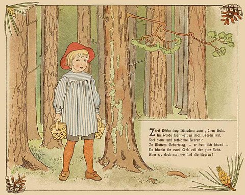


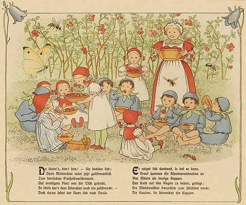


Elsa Beskow (1874-1953) is one of the most well known of Swedish childrens' books illustrators. She is said to have been greatly influenced by Walter Crane.
- The elegant yet playful art nouveau style depicted above comes from a 1910 book called Hänschen im Blaubeerenwald, online at the Traumstadt Museum.
- Elsa Beskow biography.
- Some other sites displaying her work.
Sunday, March 12, 2006
Penny Plain
 Mr. Barnes as Pantaloon
1829 etching from Drury Lane Theatre
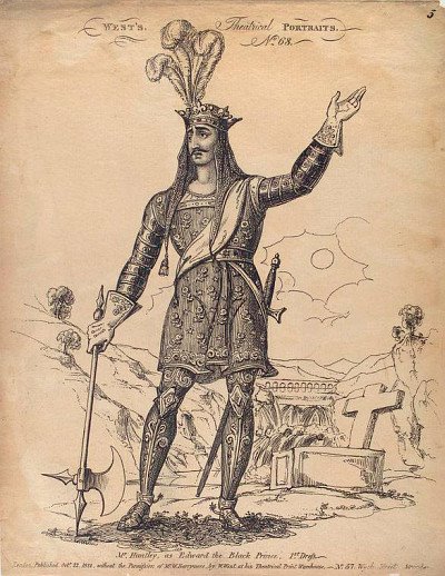 Mr. Huntley, as Edward the Black Prince, 1st dress
1822 etching
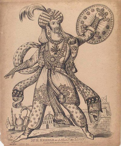 Mr. H. Kemble as Aslan the Lion
c. 1831-1834 etching
 Mr. Osbaldistone [Osbaldiston] as Rolla
c. 1837-1840 etching
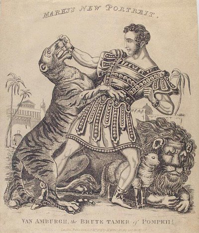 Van Amburgh, the Brute Tamer of Pompeii!
1838 etching
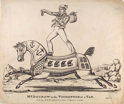 Mr. Ducrow in the Vicissitude of a Tar
c. 1820-1830 etching
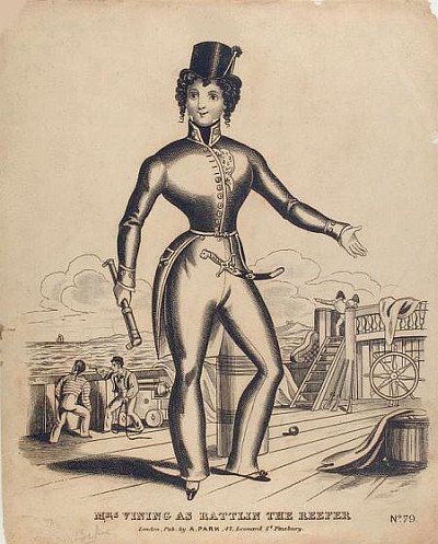 Mrs. Vining as Rattlin the Reefer
1820 etching
I was reading about a forthcoming Regency Toy Theatre exhibition in Birmingham and went searching around to see if any of the engravings were available online when I happened upon a set of 'penny plain' etchings in the Billy Rose Theatre Collection at the New York Public Library for the Performing Arts.
'The toy theatre prints in the Appleton Collection are English. By 1811 William West of London was printing sheets of stage characters for purchasers to colour, paste on cardboard and cut out, though others treaured them as individual portraits. Single prints in black ink on white paper were called "penny plains" while those with color added by the seller were the "twopence coloured."'