"This new mode was not a matter of script metamorphosing into living forms which are also readable letters, but of using script to delineate such forms. Seldom had the flexibility of the Arabic alphabet been so tested.
This practice established itself only relatively late in Islamic art, when the taboos outlawing religious iconography had lost some of their power.
[Zoomorphic calligraphy] developed [..] in Ottoman Turkey, India and Qajar Iran [and] was known as early as 1458."
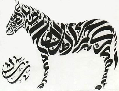


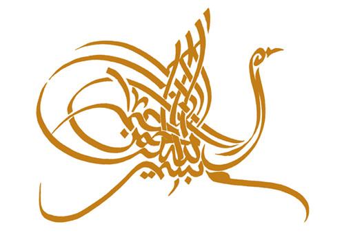

All the above zoomorphic (and anthropomorphic) works are © Hassan Musa from Sudan.
Most, but not all, of these images come from the Sudan Artists Gallery.


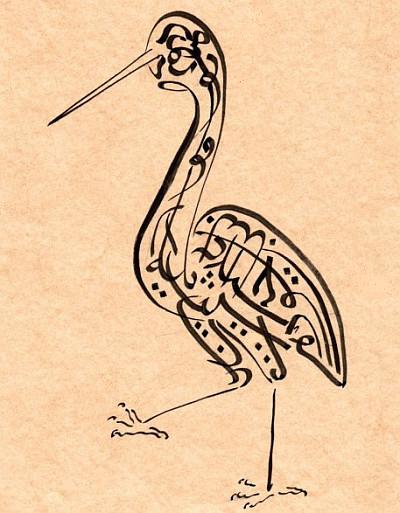


"Hafez (d. 1390) is Iran’s premier and most quoted lyric poet. His status in his own country, and his universal appeal, can be compared with that of Shakespeare in the English-speaking world. The painter and printmaker Jila Peacock has chosen ten love poems from Hafez and following the footsteps of the great Islamic calligraphers, has produced ten shape-poems that sit by her own translations from the Persian."
'Ten Poems from Hafez' by Jila Peacock includes a fascinating introduction -- and the best information online I could find about zoomorphic calligraphy -- by Robert Hillenbrand, Professor of Islamic Art at the University of Edinburgh.
'Ten Poems from Hafez' also just happens to be one of the display items in a current free exhibition at the British Museum 'Word into Art: Artists of the Modern Middle East' until September 3, 2006. {click the small book icon near the bottom of Jila Peacock's site to see the images}


17th century album leaf from Ottoman Turkey.
The inscription forming the peacock's tail reads:
"Beautiful as a houri, of angelic character, of auspicious omen, envy of the perfect ones, parrot of sweet tongue and sweet speech, peacock of the garden of … the lofty decree, sultan of the sultans of the world, fortunate and august, khaqan of the shahs, Darius of the time, Faridun of the age, hero of the world, [text reverses direction] champion of earth and time, sultans of the sultan of the family of cUthman ibn Sultan Ghazi Khan … may God extend the days of his [happiness] to the day of [judgment?]."
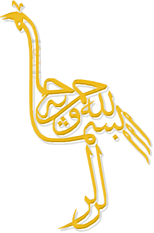

Surprisingly there doesn't appear to be any specific site or exhibition devoted solely to zoomorphic calligraphy so I went sifting with a clutch of search terms in english and arabic to find some images. If anyone knows of any other material, please post the links as a comment or email me.
Zoomorphic calligraphy is another one of those areas where I am far out of my depth and even using the array of well-polished BibiOdyssey mirrors I couldn't illuminate the subject to any worthy extent. The Hillenbrand article linked above is a good start {update: posted in full in the comments below for posterity}. I just love the art form.
- "Fine Kufic or nasta'liq in farsi Tugra Scroll measuring 118" x 9" with 13 Tugras or Zoomorphic Calligraphy drawings. Circa 1900 or earlier. Persian or possibly Urdu."
- Sakkal Design - calligraphy examples/links.
- The art of Turkish calligraphy.
- The wikipedia article on Islamic calligraphy is quite good and among the many links are some of the example illustrations above.
- Blog post on Turkish calligraphy.
- Related posts at BibliOdyssey: Arabic + calligraphy.
- UPDATE: read the comments below: I've pasted in the Hillenbrand article to ensure it is preserved.
- Books on Islamic calligraphy.





31 comments :
mindblowing
Thank you so much for this posting. What beautiful works. I love your blog!
I remember when I discover this kind of calligraphy years ago... I fell in love for it. It was the best thing I learnt with my ex-boyfriend. :D
Thanks so much for post this!
PS.: if you find any dodo or remember of any pages with dodos, can you send me a note? Thanks :)
peacay, how can i get in touch with you? I'd like to ask you something.
this is absolutely beautiful. especially for someone who has hard enough a time trying to get the english alphabet to not look like hieroglyphics. :P
very nice stuff, i'm familiar with calligraphy although i didn't know anything like zoomorphic calligraphy :)
it is really beautiful and interesting!
very nice post and good blog!
A new version of Amazings's Book. I've added this page to the recommended links of my blog (spanish language).
A million thanks for your effort when doing this page
it's really beautifull..
many kisses!
irene
I did not know these works of art and I carried out similar drawings with the impression to make a blasphemy.
Your blog is beautiful and very interesting. Great work !
It's great to see some inspired repercussions.
Can someone tell us what these calligraphs mean? Especially the first five. Thanks!
As the above cache link is dead, I'm copying in the text of Professor Robert Hillenbrand's essay [doc]:
--------[quote]
FIGURAL CALLIGRAPHY IN THE MUSLIM WORLD
The images of living creatures fashioned by Jila Peacock from Persian poetry fall naturally into a long and distinguished tradition within Islamic art. Unlike many such traditions of that art, this one is still full of vitality in our own day, and has shown an impressive capacity to regenerate itself. Indeed, it could well be argued that the art of beautiful writing – for that is what “calligraphy” means – has, alone of the major Islamic visual arts, continued its creative evolution without a break from the first Islamic century until the present day. In other words, it has been less subject to failing inspiration or to the dominance of ideas from outside the Islamic world than have all its sister arts, from architecture to painting, from pottery to carpets. If any one art can claim to evoke the essential character of the Islamic world, in medieval as in modern times, this is it.
It is worth pondering why this should be so. Part of the answer must lie in the continuously high regard in which calligraphy has always been held throughout the Islamic world. Its traditional association with the Qur’an has conferred on it a particular reverence. God, “the Supreme Pen”, first taught man to write. And Islam has always seen itself as a religion of the Word; indeed, the Word is its essential icon. This nexus of ideas helps to explain why calligraphers to this day ensure that when they copy the Qur’an they are in a state of ritual purity. As the saying goes, “Purity of writing is purity of soul”. No wonder that the copying of the sacred text has always been regarded as meritorious. Moreover, the need to ensure absolute accuracy in the transmission of that sacred text – and here the copying of the Torah by Jewish scribes offers an illuminating parallel – puts a premium on clarity and thus on the precise execution of the letters. Once that degree of care has been learned, its effects naturally make themselves felt in the writing of other, non-sacred texts as well.
But there are practical reasons as well as religious ones which help to explain why calligraphy should hold such a special place in the hearts of Muslims. It is an art open to all. Its presence is pervasive in the Islamic world to this day; the quality of signage in an ordinary street in a commercial quarter, whether in Morocco or Pakistan, is much higher than in a comparable street in a Western city. In the visual arts, inscriptions can be found everywhere, and they illustrate an endless range of variations. People who can write well are widely admired, and the basis of expression for much modern art in practically all Muslim societies is writing. Comparisons are odious, and there is no need to attempt to establish a pecking order among the world’s scripts. But even to an untutored eye, the extreme flexibility of the Arabic script – which with only very minor changes was adopted for writing such other “Islamic” languages as Persian, Turkish and Urdu – is obvious at first glance. On closer inspection, numerous other intrinsic features of this alphabet make themselves felt. They include its constantly shifting interplay between angular and curved letters, its capacity to handle with equal facility compression and prolongation alike, the visual unity that is a by-product of the absence of a majuscule (capital letter), and the way it seems to lend itself with equal ease to a very large and a very small scale, or can accommodate a sudden shift from the baseline to the upper register. Nor should one forget such apparently innate characteristics as dynamism, energy and rhythm. All this makes such calligraphy a wonderfully responsive instrument for aesthetic expression. It has a chameleon-like quality of adapting itself to all manner of purposes and moods.
What follows from that flexibility? The malleability of the constituent letters of a word can allow the calligrapher to employ such devices as symmetry, echo, antithesis and the like, and even to make words look like each other although in any modern typeface they would look distinctively different. It is here that the distinctive curvilinearity of the Arabic script – so different from the angularity of Roman or the squareness of Hebrew lettering, or for that matter the pictographic density of Chinese characters – comes into its own. It somehow allows the calligrapher access to another dimension; it is liberating. The letters can develop in virtually any direction. In many scripts they acquire fanciful terminations, whether geometric, floral or zoomorphic. Or the centre of the letter will develop an ornamental life of its own. No manual attempted to control or systematise these idiosyncrasies. Even Victorian copperplate – the closest that Western handwriting in standard use (as distinct from professional calligraphy employing a variety of italic hands) comes to that curvilinearity – is far more constrained by the rule-book than the Arabic script. Moreover, formal inscriptions in the West are almost uniformly executed in Roman (or Greek) capitals, and the conventions that apply in that context are extremely restrictive in comparison with those that operate in formal contexts in Islamic inscriptions.
Of course this does not mean that there are no rules which underpin Islamic calligraphy. But there is no need to engage in deep study of this art to realise that, while there are indeed rules to follow, these rules sit very lightly on the masters of the craft. We are told, for example, that the celebrated calligrapher Ibn al-Bawwab followed the standardisation of scripts introduced by his predecessor Ibn Muqlah a generation earlier in the tenth century. A key feature of that attempt at uniformity was the system whereby each letter was composed of a certain number of dots. Thus there was in theory an “ideal” way to form each letter, almost as if the calligrapher were turning himself into a typewriter. But one has only to study closely a page of the Qur’an in the Chester Beatty Library, Dublin, dated 397/1000, which is signed by Ibn al-Bawwab, to note that he can write the same letter (e.g. kaf) in as many as six different ways in a short passage. That variety is not only what distinguishes a page of his work from that of a typewriter, but also what gives it life. This small example shows how profoundly unreliable the manuals on calligraphy can be. They can plainly be contradicted by the evidence of the work itself. This is also the clearest proof that mastery can as well express itself in creative disobedience to the rules as in following them to the letter.
As it happens, the calligraphic tradition honours both kinds of masters, though to judge by the histories of calligraphy it is those who can best copy their predecessors who form the great majority. As in classic Persian painting, one mark of having reached the status of master was the ability to copy closely the great work of the past. Hence the genealogical nature of so many of the accounts of the great calligraphers. The citation of the past masters in the same style is an integral part of describing the work of a given great calligrapher. What we are never told in such frankly formulaic and adulatory accounts is precisely how the work of one master differed from that, say, of his immediate predecessors in that particular style. At any rate, the relationship to earlier masters is the principal element of the calligraphy that is recorded for posterity – not whether that person devised a new way of constructing a given letter or ligature, or introduced a new layout for the page. It is almost as if the reader is expected to know that kind of thing without any help.
This situation highlights a perennial difficulty in how calligraphy is assessed within the Islamic tradition: the lack of a useful and generally understandable vocabulary of criticism. What exactly is it that constitutes a weak, average or superlative hand? The great calligraphers themselves have left very little in the way of clues. This is not surprising, for one very rarely finds in the same person the capacities of the creative artist and the discriminating critic. Those who produce masterpieces are seldom able to explain how they did it. But there is also a strong tradition of masters deliberately concealing the secrets of their craft, for example hiding from sight the way that they cut their reed pens. In part this conforms to the custom of passing on craft techniques from master to pupil rather than putting them into the public domain. Whatever the reason, the result is plain: there is no easy guide to what makes great calligraphy. Inductive reasoning is required.
One innate characteristic of the flexibility noted above is that the letters can suggest something beyond their verbal meaning. This further significance may be purely abstract, for example if it creates some kind of pattern, whether through the design and placing of individual letters or of blocks of text, which themselves might be so arranged as to create further texts; but it can also enrich the meaning of the words themselves, or set up quite other meanings. An example from the Ibn al-Bawwab manuscript just mentioned is the preternaturally elongated ba in the bi’sm of bismillah (“in the name of God”) placed at the opening of each sura (chapter). This serves as a visual marker, like punctuation or underlining. It indicates the beginning of a new part of the text. But it has an aural quality too, as if it denoted a long-drawn-out and possibly louder sound. This is the closest that Islamic calligraphy gets to the historiated initial letter so beloved of the tradition of medieval Western illumination.
The delight in constantly expanding the boundaries of expression explains why so many contrived scripts were invented in the course of the centuries – scripts named after the full moon or the crescent moon, after dust or the locks of the bride, after trembling or after flowers or peacocks. But perhaps the most radical experiments with calligraphy were those which involved figural designs. The earliest attempts to do this can be seen in the inlaid metalwork made in the eastern Iranian world in the twelfth century. Perhaps the first major example of this trend is to be found on the so-called Bobrinski bucket made in 1163 in Herat (now in the Hermitage, St Petersburg). This provenance is significant. Herat is sufficiently distant from Armenia, the easternmost part of the Christian world to experiment – as did other Christian traditions – with the notion of making letters of the alphabet come to life with figural or zoomorphic elements, to make it likely that this was an independent local invention. Indeed, it was the Iranian world that was destined to produce the richest variety of work in this sophisticated subset of calligraphic invention. The beginnings of this mode in Herat are modest, but they already display two distinct modes. The simpler of the two (significantly placed at the base of the bucket’s curvature, not a prime location, and interwoven with a frieze of running animals) involves incising faces onto the thickened upper shafts of the tallest letters. These faces could hardly be simpler: an eyebrow, an eye and a mouth, with a neck below it. But in a larger band, advantageously placed at the top of bucket’s curvature and thus the natural first focus of attention, the artist takes advantage of the extra space available to animate the letters still further. Now, the shafts of the taller letters have morphed into legless bodies, some upright, some leaning forwards or backwards, some bearded, some clean-shaven, some with long kiss-curls or pointed hats. They interact with unmistakable humour, chucking each other under the chin, patting each other on the shoulder or tweaking each other’s ears, shaking hands, holding beakers or jugs, and stirring bowls. Thus the upper storey of the inscription is shot through with narrative while its ground floor spells out a message of good wishes and happy life. In this way the figural elements tacked on to the letters themselves not only enrich but also reinforce the content of the inscription. This fashion of animated inscriptions lasted for the best part of a century and a half. It ranged from shafts ending in a head, giving the visual effect of a long row of circles at the very top of the band, to tightly packed seated figures gesticulating vigorously, and finally the Arabic letters themselves either give birth to, or are integrated almost seamlessly with archers, spearmen and swordsmen in combat, revellers, and dancers performing to the music of tambourine, harp and wind instruments. All this occurs in the context of letters ending in the heads of dogs, hares, bears, harpies and birds, as in the famous Wade Cup (in The Cleveland Museum of Art).
The next experiment in bringing living creatures into the ambit of calligraphy was even more radical, and it seems also to have originated in the Iranian world. Here we meet the ancestors of modern masters like Ahmad Mustafa and Jila Peacock. This new mode was not a matter of script metamorphosing into living forms which are also readable letters, but of using script to delineate such forms. Seldom had the flexibility of the Arabic alphabet been so tested. This practice established itself only relatively late in Islamic art, when the taboos outlawing religious iconography had lost some of their power. Indeed, it developed in the very same areas – Ottoman Turkey, India and Qajar Iran – where iconographic cycles of complex narrative scope involving the lives of Muhammad, ‘Ali and certain Islamic saints gradually won a degree of popularity. Clearly, then, the practice is related to a loosening of earlier restraints.
When did this practice begin? According to a treatise on calligraphy written by Qadi Ahmad around 1606, it was once again in the city of Herat that this invention was made. The alleged inventor, Maulana Mahmud Chapnivis, “wrote the hemistich: ‘The price of sugar and candy has come down because of the lips of the beloved,’ on two sides [in mirror writing?], in the shape of three or four men standing one under the other, and both the figures and the writing were executed with perfect skill and charm”. No date is given, but the context suggests the reign of Shah Tahmasp (1524–76). This all sounds convincing enough, but once again it is contradicted by the facts, which show that zoomorphic calligraphy was known at least as early as 1458, when a certain ‘Ata Allah b. Muhammad al-Tabrizi produced a scroll (now in the Topkapi Saray in Istanbul) which included this motif.
Perhaps the most celebrated of the early attempts in this mode is a probably sixteenth-century pacing open-mouthed lion, largely created in gold both within the body and in outline by a prayer to ‘Ali, the Prophet’s cousin and son-in-law, known as Nad ‘Ali. Since ‘Ali was known as Haidar, “lion”, the design is also a visual pun. The piece is signed by the scribe ‘Ali who “cut it out”. The calligraphy fills the body only loosely, and scattered white and red blossoms, sprays and tendrils, as well as a continuous lapis-blue ground, serve to fill the many gaps. Thus script and decoration counterbalance each other, and to some extent are even at cross purposes; this is by no means a purely calligraphic exercise. This lavish use of infill, and the sudden thinning of the outline at breaks of sense, suggests that the conventions of this kind of calligraphic tour de force were not yet fully established. In particular, the emphasis on outline, which involved many awkward curves, points – despite the calligrapher’s obvious skill – to a certain unease with this form of expression. Perhaps the clearest sign of this is the fact that the tail is only feebly incorporated into the text of the prayer; indeed, the tail remained a problem in many subsequent renderings of calligraphic lions.
Later essays in this manner, whether of tigers, parrots, ostriches, storks or cockerels, though often constrained to add such necessary details as feet, tail or crest without recourse to writing, tended to minimise if not exclude added ornament, and indeed polychromy, so that the calligraphy itself reigned supreme. Gradually calligraphers learned to use outline better, for example in the depiction of fruit or the conical hat of the poet Maulana Jalal al-Din Rumi. The calligraphy of such designs, whether of living beings or other subjects, was usually of pious content, even if (as in the case of a human face created entirely by writing) this consisted entirely of venerated names such as Allah, Muhammad, ‘Ali and his two sons Hasan and Husain. This goes also for the many essays involving cursive hands, and also rectilinear Kufic, to create images of mosques, boats (the ship of salvation and Noah’s Ark), helmets, lamps and vases. Very often the image thus created has its own symbolic associations which are independent of the writing of which it is formed, though that writing may further deepen the meaning of the image. Thus a mihrab may be formed of a quotation from the Qur’an attacking unbelievers, or a multi-domed mosque complete with minarets may appropriately be constructed out of the words of the shahada, the Muslim profession of faith. In a still more ambitious design, a huge horse composed of the Throne Verse (Qur’an 2: 255) carries a dignitary whose tiny scale underlines both the pride of man – perhaps also symbolised, in yet another pun, by his throne-like saddle – and his insignificance before God, as represented here by His Word.
Given the complexity of these “word-pictures” and the clearly symbolic use to which they put the Arabic script, it is not surprising that magic powers were often ascribed to them and that they served as amulets. In such images one encounters an out-and-out violation of Islamic norms, in which blasphemy is added to injury because it is so often the very words of the Qur’an which are tortured into forming the previously hated images. In his defence against such an accusation the scribe would no doubt argue that to create forms by means of actual letters would so distance those forms from reality that no-one could reasonably believe that he was trying to breathe life into them. Even when the texts are not Qur’anic, their normal content is prayers or invocations and benedictions, rather than secular matter. It is this detail which clinches the religious intent of such images, for at the time that they began to be made figural art had already been established in the Islamic world for a millennium. There would have been no difficulty in forming images from secular as distinct from religious texts, and the contemporary fashion for creating images out of smaller figures or objects in the style of Arcimboldo (the Renaissance painter famed for his fantastical portraits made up of vegetables and fruit) shows that the idea had already long been in the air at the time. The choice of religious texts for these figural images, then, betrays the desire both to flout and to circumvent the orthodox disapproval of religious images.
In many of these calligraphic images, one senses that writing is being pushed to its furthest limits so as to make it express unnaturally what it cannot do naturally. With their elaborate mirror-writing and the flavour of secrecy and cipher which pervades them, these arcane images offer striking evidence as to the slightly perverse outlets into which Islamic artists channelled their frustrated desires to create religious pictures. It was a current which proved too strong for Islamic orthodoxy to dam, but that same orthodoxy compelled it to take a remarkably roundabout route before it found the expression it craved.
This, then, is the wider context of the images that Jila Peacock has created out of the poems of Hafez. Where, one might ask, does she belong within this tradition? She differs from most of her predecessors on many points: her choice of text; her use of nasta’liq rather than some other cursive script; the density of calligraphic mass which makes up her images; the sheer range of creatures she depicts; and the way she glories in that dimension of colour which most practitioners in this specialised field discarded. These features bear further discussion.
The texts are taken from the Divan of Hafez (d.1390), Iran’s premier and most quoted lyric poet, whose status in his own country can be compared with that of Shakespeare in the English-speaking world. As the saying goes, every Persian home has a Qur’an and a Hafez. His magical use of language, his towering spirituality, the passion with which he explores the seemingly inexhaustible themes of love and wine, his vehement satire and invective, the mysticism which suffuses so many of his lyrics, and the subtlety and allusiveness which permit so many contradictory interpretations depending on the reader’s mood, have endeared him to generations of Persian speakers from Turkey and Iraq to India and Central Asia. Not for nothing is his tomb in Shiraz to this day a magnet for lovers and for connoisseurs of poetry. He is, moreover, popularly regarded as a seer and soothsayer, and his lyrics are often used to this day for purposes of divination, much in the manner of an astrological column in a modern newspaper. Thus the text of Hafez, while not holy writ like the Qur’an, is – like that of no other writer of poetry or prose – part of the warp and weft of Persian life.
What follows from the use of nasta’liq for these images? To begin with, this is a ductus not often used for calligraphic pictures. This type of script, above all other Islamic hands, encourages the most complex rhythms and asymmetries, with its natural tendency towards the layering or tiering of words and phrases, its swooping lines, its constant switching from razor-thin to fat, thick strokes, its full-bottomed curves and its powerful momentum – the very image of rapid thought. These characteristics allow the artist to vary the nature of the outline not only from one creature to the next but also within a given image. Thus in the case of the fish (whose outline itself recalls a flourish of nasta’liq, for example a terminal letter nun) only a very few letter forms suffice to suggest the upward curve of its back, the flick of its tail and the jut of a fin. This function of nasta’liq suggests an affiliation to the changing thickness of line in superlative draughtsmanship.
Traditionally, most calligraphic pictures rely heavily on outline, often of a very contrived kind, in order to establish the shape of the object which is being portrayed. That in turn demotes the writing inside the outline to infill. Jila Peacock’s technique does not privilege any part of the text in that way. It builds up the form of the creature as if techniques of modelling were being employed. Thus sometimes the letters and words are densely packed, while at other times the arrangement is looser, though never so loose as to break down into incoherence or to leave awkward gaps. It is a delight to admire the high-stepping canter of the horse, the proud sweep of the peacock’s tail or the branching antlers of the stag, details which are perfectly captured in this technique.
Some scholars argue that there is a subtle but almost invisible unity that links each hemistich to the next in his ghazals; others prefer to see them as “Orient pearls at random strung”. But in either case, the choice of creature for illustration picks out one element – often the key image of the poem – for special attention. When the image and the poem from which it is taken are considered together, and the reader meditates on the connection, the words of Hafez come alive, often in an unexpected and gripping way. “Neither noose nor net shall capture the bird of wisdom”, for instance, seems a peculiarly apposite caption to the image of a bird whose very body is made up of wise words. Since Jila Peacock has herself translated the text which she has fashioned into these shapes, she is uniquely placed to plumb the subtleties of the poet’s diction, and to bring word and image together. The poem which begins “O Heaven show me your redemptive fire” contains the stanza
O fellowship of that blissful flame,
Pray call on God to tell me
Whose is the burning butterfly, whose?
The insistent questioning of this poem, its anxious uncertainties, its intensity, its repeated images of fire, find apt expression in the tremulous fluttering of the outspread wings of the butterfly. It is the very image of mutability. It is here that the very lack of firm outline in these pictures comes into its own, for the continuously broken silhouette conveys the pulse of life itself. One last example must suffice. The couplet
The falcons of the path repose content as flies,
Such is the sweetness of the world.
speaks of repose, not action; but a few lines later the mood changes abruptly:
How many bells must ring
To rouse you from your daze?
Pity a bird like you
Imprisoned in a cage.
Spread your wings and sing
From the Tree of Paradise.
and it is this moment of dynamic energy that the artist has captured in her image of the hovering falcon with its wings beating powerfully and its talons outstretched. The rendering of each of the last three outer primaries by an outsize letter ya epitomises the inherent flexibility and expressive power of this nasta’liq script.
Finally, what of the dimension of colour? As suggested above, artists in earlier centuries who experimented with figural calligraphy tended to work in monochrome. But recent practice in this genre has eagerly embraced the potential of colour. In colour, as in other respects, the images in this book operate on more than one level. The use of different colours for successive images gives each of them its own distinctive character. But the sequence of strong colours also has a cumulative enriching effect on the whole book. And when an image is viewed at an oblique angle, it comes to life in a dramatically different way, seeming to leap off the page. The shimmering, reflective quality of the writing as it catches the light evokes the quintessentially Islamic medium of lustre pottery or glass, whose fitful iridescence suggests the glint of such precious materials as silver and gold. Thus the dimension of colour sets up a certain ambiguity whose character changes from one image to the next. This is because not only the background colour changes, but also the colour used for the script itself, which is by turns emerald, magenta, silver, violet, turquoise, vermilion and so on. One might catch an echo of the famed allusiveness and ambiguity of Hafez himself in this constantly shifting panorama.
Jila Peacock, then, like a host of Islamic scribes before her, illustrates in our own day the untiring virtuosity of those who use the Arabic and Persian script as their preferred form of visual expression. Thanks to her choice of Hafez as a text, her innovative use of nasta’liq, her sensitive handling of script as mass, her imaginative bestiary and her radical approach to colour, she has revealed new riches in this traditional genre.
Robert Hillenbrand
--------------------[unquote]
Beautiful work.
Wave Dancing Chinese Calligraphy.
Can anyone translate the woman? Most of these are Quranic verses, but I would be surprised if that were the case for the woman shape. I would really appreciate it if anyone can help. For me, the very fact that this form of calligraphy grew out of prohibitions on depicting living forms, makes the woman the most interested and expressive.
#1. not sure but I think it means zebra
#3. Elephant
#4. the letter Kha' of the Arabic alphabet
#5. tiger
#6. In the name of God, the All merciful,
sorry, but thats all I can make out :) alot of them
is actually written in Persian language which alphabet
is similar to that of the Arabic language,
they're really beautiful :)
thanks for posting them,
Re the"Woman"
Gender is ambiguous I think. Script is the Shihadah in Islam - I testify that there is but one God (no God but God) and that Mohammed is his prophet.
is the elephant picture a poem? or does it say or mean anything other than elephant??
I am so interested and intrigued by this art, it's wonderful. Can anyone help me, I'd like to know if the elephant art means anything other than elephant, is it a saying or a poem of some kind? I'd really love it if someone could translate it or help me out! I believe it is in Arabic calligraphy. Thank you!
Just... wow.
If anyone is interested in knowing what the elephannt calligraphy means, its actually a verse from the Koran which in rough translation says "Did you not see how the lord dealt with those who accompanied the elephant." Its has a very fascinating story behind it, I'd recommend reading about it.
Does anyone know who makes these? How can I get in touch with the creator of these??
Natalia, there are art works from a number of sources. If you read through the post carefully and follow all the links, you will find the artist or the sites where old works came from.
Doesy anyone could translate the second calligraphy ? With man on the horse. Thanks
Lovely works :)
hey, so I really want a tat of a chrysanthemum made out of arabic characters which would spell the name of the flower. do you have anything like this?
to anpuopolo:
I can certainly make a design like that for you. However, the word for Chrysanthemum in Arabic is quite short. If I were too create a design using only that word, it would require allot of 'djali' or ornamental marks, which would not be very true to the art. I would recommend writing something a little longer, ideally four or five words, to get the best design with the least amount of 'djali'. If you want to see some of my work to get an idea of what I do, you can see it at etsy.com/people/everittebarbee
If you're still interested please e-mail me at everittegb@gmail.com, I will always send you a digital preview of the work before I request any form of payment.
Too bad they aren't 100% text.
man on the horse ,Does anyone could translate the second calligraphy ? With man on the horse. Thanks
'Unknown' writes :
"Portraying figurative images with verses from Quran is highly degrading.
The artists probably think that they are being very creative but I DETEST SUCH KIND OF WORK."
what is the 6th picture stand for? i mean, what is the meaning....? i need it in Arabic quote, also the meaning in English :D
Post a Comment
Comments are all moderated so don't waste your time spamming: they will never show up.
If you include ANY links that aren't pertinent to the blog post or discussion they will be deleted and a rash will break out in your underwear.
Also: please play the ball and not the person.
Note: only a member of this blog may post a comment.