
Newsreel Theatre 'Rio' (date unknown)
This design makes good use of a small urban lot by maximizing the advertising space. The design above the marquee is one unit, the design below another. The projecting marquee attracts the attention of both driver and pedestrian. The exterior could be of concrete, plaster, terra cotta, glass or plastic, the lettering in copper or white metal.

Newsreel Theatre 'Town' (date unknown)
Note on reverse: "This spectacular design has been planned to care for a change in theatre patronage. It is meant to speak up to the people to come in and see what is inside, and is planned for a locality where the newsreel has become an attraction."

Newsreel Theatre 'Sign' (date unknown)
Note on reverse: "This theatre is built with a glass front so the lobby may be viewed from the street. This makes the front entertaining in itself and stresses the fact that entertainment is housed within. The poster cases are designed to sell the show."

Newsreel Theatre 'Park' (date unknown)
This theatre is designed with a glass front. The box office has an automobile entrance to the parking lot with an automobile exit on the other side of the building. At night varicolored lights play on the façade and the building forms its own reflective background.

Newsreel Theatre 'La Vona' (date unknown)
Note on reverse: "This theatre shall be its own advertising and the front shall sell the picture. Each row will have different colored lighting arrangements and the whole will be a blaze of color with the new fluorescent lighting units."

Newsreel Theatre 'Diana' (date unknown)
Note on reverse: "This theatre is designed to be built in plastic.."
Note on reverse: "This theatre is designed to be built in plastic.."
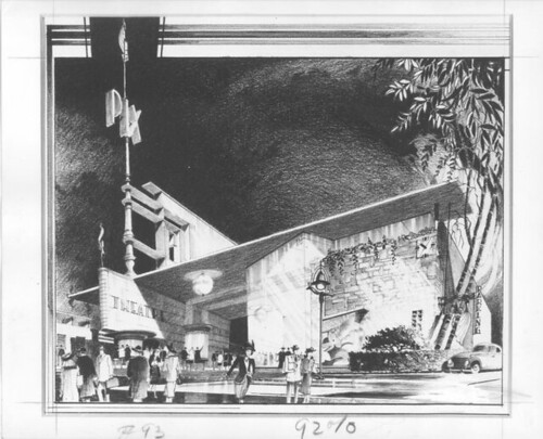
Newsreel Theatre "Pix" (date unknown)
Note on reverse: "This theatre is designed for a residential neighborhood of modern character. It will be built of glass and stone."

Newsreel Theatre, Oakland, San Francisco (1942)
Lee's rendering depicts an eye-catching marquee, probably with a revolving and illuminated globe, attached to the three-story retail and office building in downtown Oakland.
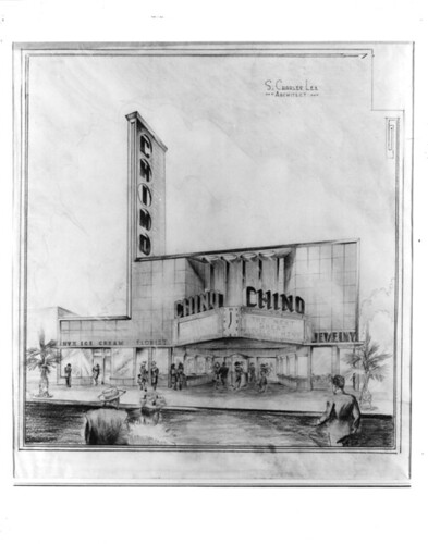
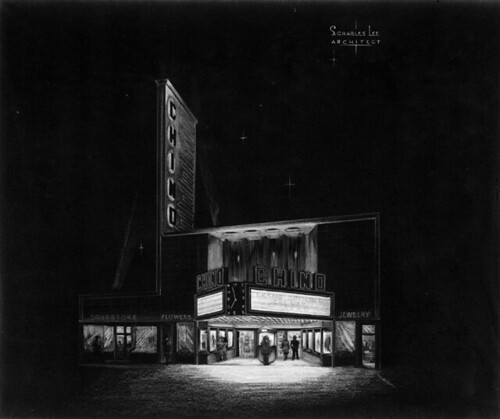
Chino Theatre, San Bernadino County
Night and day perspective drawings (1947)
Night and day perspective drawings (1947)
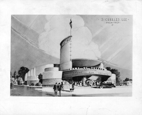
Academy Theatre, Inglewood, Los Angeles (1939)
The rendering shows a super streamlined design built up from overlapping circles. Glass block and a stark white finish enhance the sleek modern image. Lee developed the design of the tower to depict a reel of film unwinding.
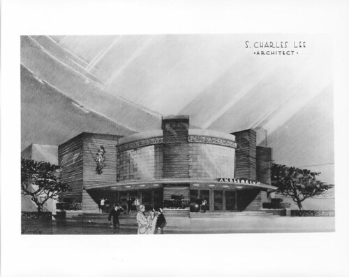
Disney Theater (1939-1941)
The Disney Theatre was used for private screenings on the Disney lot. Lee's concept shows a glistening exterior of shiny materials, perhaps glass or ceramic tile. To add height and presence to the building, Lee set the entrance up on a podium and accented the semi-circular Streamline Moderne façade with vertical tower forms. A broad overhanding marquee echoes the circular form of the façade; its recessed lights illuminate the glass-walled foyer and the area around the entrance.

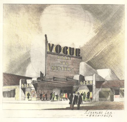
Fox Theatre, Redondo Beach, Los Angeles (1937-1939)
These concept drawings replace the previous Spanish Colonial Revival façade with Streamline Moderne designs, current in the late 1930s.
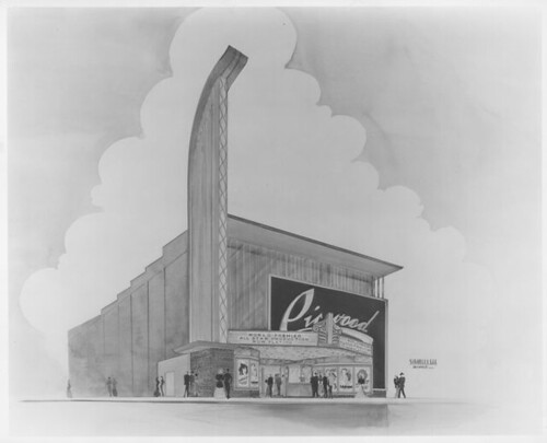
Picwood Theatre, Los Angeles (1946)
The Picwood was designed as a neighborhood theatre on Pico Boulevard in West Los Angeles. The design epitomized the modern post-war aesthetic, which required simple lines, inexpensive building materials and quick construction to satisfy the post-war boom. The simple curved pylon was a landmark in the flat landscape of one- and two-story building.
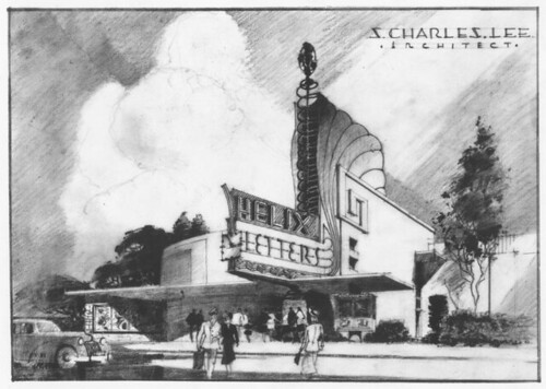
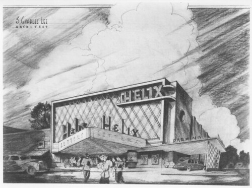
Helix Theatre, La Mesa, San Diego
This concept drawing, probably executed before World War II, uses simple curved forms of Streamline Moderne in the building. A huge sign with a spiral or helix-shaped tower dominates the façade. (oddly, the date is given as 1947-48)
Helix Theatre, La Mesa, San Diego (1947-48)
A later concept drawing shows a scaled-down design which is more conventional in massing. Streamline forms can still be seen in the sign area and in the porthole window on the right wall. However, the chief design elements have evolved from the smooth to the angular, with walls, marquee and canopies project out and up at angles.
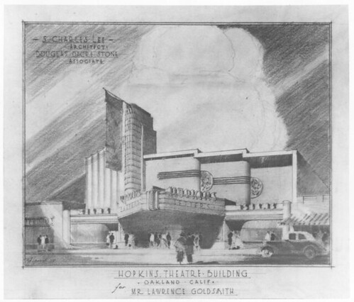
Hopkins Theatre, Oakland, San Franciso
This elaborate concept drawing, from 1939-1941, shows a Streamline Moderne design using convex and concave curves, a prow-shaped pylon, and angular massing.

Lakewood Theatre, Lakewood, Los Angeles (1944-1945)
Probably hoping to get a larger commission than just a theatre, Lee produced this perspective sketch of his concept for a theatre integrated with a bank and a retail store. The Los Angeles suburb of Lakewood was a post-war phenomenon, when thousands of houses were built in record time, creating an entirely new community. Lakewood needed everything for its shopping center, banks, stores and of course a motion picture theatre.

Lakewood Theatre, Lakewood, Los Angeles (1944-1945)
This later rendering was far more streamlined than the earlier version, with curving walls, porthole openings and prow-like pylons. The airplane flying overhead reinforces the streamlined imagery.
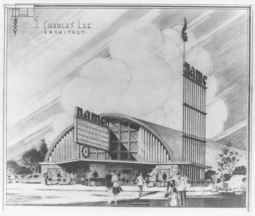
Puente Theatre, La Puente (1947-1948)
Lee's sketch offers a prototype for a theatre that could be built cheaply and quickly. The simplest means of quickly constructing a theatre-sized space was to build a Quonset hut, a method devised in the late 1930s using small wood members to create an arched truss frame, which was then often clad in metal for warehouse purposes. A number of motion picture theatres were built in this way. They offered inexpensive rapid construction of theatre spaces in small towns such as La Puente, an agricultural community east of Los Angeles.
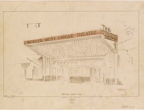
Studio Theatre, Hollywood (1931)
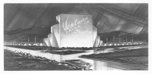
Drive-in theatre, Ventura (date unknown)
This earliest-known concept for a drive-in theater by Lee, the Ventura Drive-In, shows a sophisticated use of illuminated triangular forms massed alongside the large illuminated screen structure and along the edges of the parking lot, creating an advertising sign for the theater out of the drive-in form itself. The sharp-edged forms are clearly Art Deco in character, a style that is sometimes called Zig-Zag Moderne. The design vocabulary was adapted from usage current in theatre design at the time.
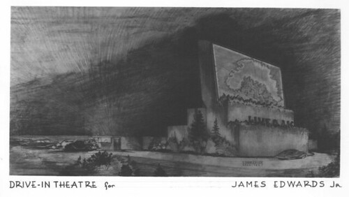
Drive-in theatre, Arcadia, Los Angeles (1948)
The drive-in theatre concept was first tried in the mid-1930s but only after World War II did the idea gain widespread acceptance. Lee designed several drive-in theaters, a type especially suited to the mild climate and car-dependent economy of Southern California. The drive-in allowed the whole family to go to the movies in the family car, with no need for a baby-sitter. It also proved especially popular with dating teenagers, who found drive-ins the ideal refuge from watchful adult eyes. The drive-in was also cheap to build. A large piece of land, a structure to display the screen and smaller buildings for tickets, refreshments and the projector were all that was needed. The parking lot was usually graded to provide the parked cars with a good angle for viewing the screen, and each space was equipped with a speaker that could be hooked to the dashboard to bring the sound into the car.
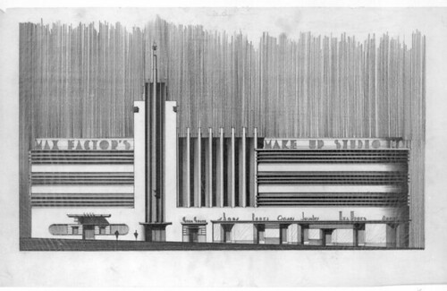
Max Factor Building, Hollywood (1935)
In 1935 Lee submitted two designs for the remodeling of Max Factor's showroom and manufacturing facility on Highland Avenue in Hollywood: an elegant Streamline Moderne high-rise, shown in this rendering, and a more modest Art Deco concept, which today houses the Hollywood Museum.
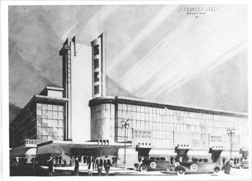
Department Store
(concept drawing, undated, never built)
(concept drawing, undated, never built)
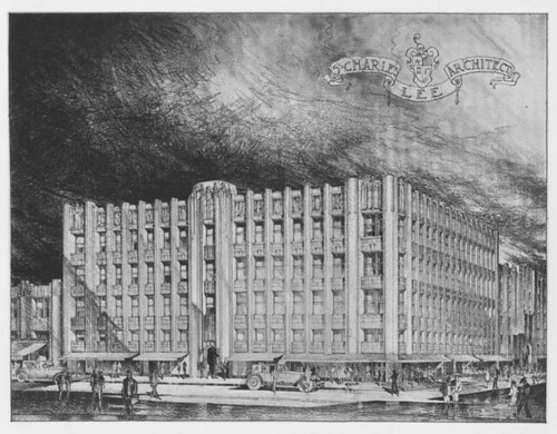
Office Building/Retail Stores
(concept drawing, undated, never built)
(concept drawing, undated, never built)
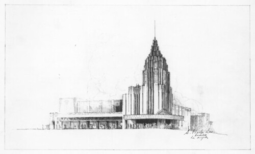
Office Tower/Retail Stores
(concept drawing, undated, never built)
(concept drawing, undated, never built)

Office Tower/Retail Stores
(concept drawing, undated, never built)
(concept drawing, undated, never built)

Office Tower/Retail Stores
(concept drawing, 1926, never built)
(concept drawing, 1926, never built)
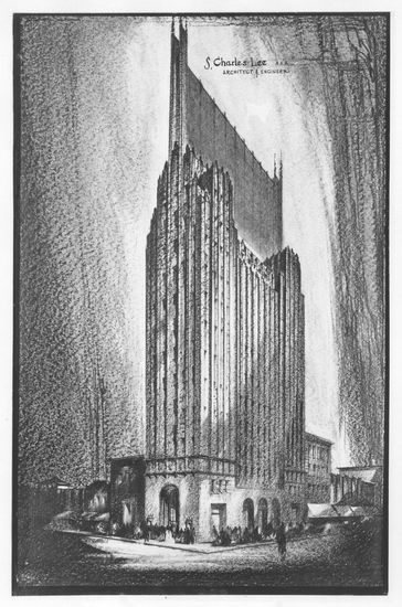
Office Tower
(concept drawing, undated, never built)
(concept drawing, undated, never built)
"S. Charles Lee, born Simeon Charles Levi in Chicago in 1899, was the son of American-born parents of German-Jewish ancestry, Julius and Hattie (Stiller) Levi. Lee (who later changed his name from Levi) grew up in the Chicago of Daniel Burnham, Louis Sullivan, and Frank Lloyd Wright. Lee's own favorite building was Sullivan's Carson Pirie Scott Department Store. He also grew up with the evolving motion picture; he went to vaudeville theatres, nickelodeons,and early movie houses. A tinkerer interested in mechanical things, Lee built three motorcars as a teenager. His interest in mechanics took him to Lake Technical High School in Chicago.
He started out in architecture in 1915 by working after school in the office of Chicago architect Henry Newhouse, a family friend. Newhouse specialized in theatre design: small motion picture houses, nickelodeons and remodeling storefronts into theatres. After graduation in 1916, Lee attended Chicago Technical College, graduating with honors in 1918. His first job was as architect for the South Park Board of the City of Chicago. During World War II he enlisted in the Navy. After his discharge in 1920, he entered the Armour Institute of Technology to study architecture. The course followed the principles of the Ecole des Beaux Arts and this training is reflected in the composition and imagery of his later drawings. It is also reflected in his own emphasis on the plan as the driving force of the design. This practical approach would serve him well in his many commercial designs.
Other influences on the young architect were Sullivan's lectures in his architecture classes and Wright's work, particularly Midway Gardens and Wright's house and studio in Oak Park. Lee was also impressed by the 1922 Chicago Tribune tower competition, which juxtaposed historicism with modernism. Lee considered himself a modernist, and his career revealed "both the Beaux Arts discipline and emphasis on planning and the modernist functionalism and freedom of form."* He was also a pragmatist, designing his buildings to support and enhance the commercial ventures they housed."
[by Ann Scheid, 2000]
- In addition to the images, all the commentary/captions above is/are quoted or adapted from the S Charles Lee Collection website at UCLA Library.
- Alternatively, the collection is accessible from the Online Archive of California (there may be additional items here: my current bandwidth throttling prevents deep delving)
- Classic movie theaters designed by S. Charles Lee.
- Art Deco Society of California / Art Deco Society of Los Angeles.
- Art Deco buildings in California.
- Previously: Walter Burley Griffin.
- Amazon.










13 comments :
Superbe ! de la grande architecture.
A bientôt...:)
How timely, seeing as I just got back to California. (I guess the El Cerrito art deco theater around the corner was not a Lee design...)
The thought of a theater intended to be built in plastic is rather startling.
A small corrective: while I think you can get away with calling some of the Los Angeles area towns "Los Angeles" (I think some are incorporated cities and some are just areas), Oakland can't really be called "San Francisco." It's across the bay and is one of the largest cities in the state. I was guessing it was even bigger than San Francisco but Wikipedia says not.
Merci Pignouf!
Let's see if I can have a crack at this without it being either too defensive or too terse; but some of these points that follow are meant in a general sense (because I get mail about this sort of thing from time to time).
Not everyone who visits this site is American (and certainly, I'm not).
Captions are not usually/really aimed at locals. They are not always - as in this case - going to be what one ought to write on a letter for the post office.
Anyone who visits this site sometimes or regularly knows, I hope, that I make good faith attempts at being factually correct. Sometimes I make mistakes for which I'm thankful for correction.
Although the breadth of material covered in general tends to give this site a bit of a travelogue dimension (thankfully!), unless the geographical aspect is a primary consideration, a 'best approximation' is sometimes deemed an adequate gloss or attempt.
There is an ephemeral point of view or attitude in construction of posts that toggles between general and esoteric knowledge and its calibration is dependent both upon my own general knowledge and what I suspect is the happy point of understanding, in each situation, for 'most people'. It's almost certain that the majority of visitors to this site are, in fact, American, so in cases where Americana is the topic, that point of view probably veers more towards what the 'average person', such as myself, or, say, a regular European person, might think and know.
In the case of this particular post, you'll note the URL (I accidentally published the post for a couple of hours when I meant to save it in draft) which tells you that I ended up widening the scope beyond Los Angeles (although most of Lee's work is concentrated there). So identifying Oakland as being 'Oakland, SF' is more about delineation rather than post office accuracy.
The dates on the Helix Theatre renderings are correct. Much of the late 1930s design vocabulary remained in use in the first years after World War II, as if dormant and then revived. Lee's second design for the Helix Theatre, the one with the diamond-grid facade, was built in 1948. It have been quite a stand-out in La Mesa, which in 1948 was a small agricultural town of mostly avocado and lemon growers. Located several miles east of San Diego, La Mesa would become a commuters' bedroom suburb in the 1early 960s. The theater was demolished several years ago. A photo of the theater as-built is also on the UCLA archive site, at http://content.cdlib.org/ark:/13030/kt438nc5g4/?docId=kt438nc5g4&layout=printable-details
Actually, I only meant that maybe adding "area" to Los Angeles or San Francisco would have satisfied in all regards. (she said mildly.)
interesting! thanks, pk and best of the holidays to ya!
Thanks very much Will - I guess I was mixing up design -vs- render date. I just noticed - here - that one third of Lee's theatres have now been demolished and another third are closed. Way of the world.
You can have this back Karla (I know, I know. I just took it as an opportunity to get all expansive for the record)
Merry Silly Season lotusgreen!
Words fail me...
Hook was j.o.k.e.
Knew that, just wasn't sure which of my various remarks said j.o.k.e. hooked. How literal vs how figurative, etc. Je comprends.
Thanks for a fun (and intense) collection of images, peacay. Lee obvioulsy didn't believe in going halfway-- this stuff is art deco on steroids. I had to laugh at the description of Lee as a "pragmatist." Any architect who replaces a "Spanish colonial" building with a theatre from Mars is either a flamboyant dreamer or is dealing with a neighborhood that has changed greatly over the years.
This is probably as good a time as any to wish you a happy holiday and to thank you for all of the fascinating, fun, mind-expanding material you have delivered up to us in 2008. A trip to this site is always rewarding, and I have never left it without the dismaying feeling that I simply don't have time to harvest all that I should here.
Health, happiness and prosperity to you and BibliOdyssey in 2009!
David, I'm always grateful for your classy and generous comments and I hope the silly season is passing tolerably/wonderfully for you. Cheers!
Beautiful stuff. Inspiring.
Post a Comment
Comments are all moderated so don't waste your time spamming: they will never show up.
If you include ANY links that aren't pertinent to the blog post or discussion they will be deleted and a rash will break out in your underwear.
Also: please play the ball and not the person.
Note: only a member of this blog may post a comment.