






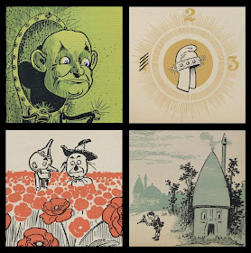

[click to enlarge images - some minor cosmetic blemishes have been removed from all of them]
 William Wallace Denslow (1856-1915) attended art and design schools in New York City and published his first illustrations in 'Hearth and Home' at the age of eighteen. For the next twenty five years he plied his trade all over the country, supplying magazine, newspaper, advertising and book illustrations to a wide variety of publications, and he was a well known poster artist by the mid-1890s.
 For a few years Denslow worked part-time for Elbert Hubbard at the Roycroft Arts Community in East Aurora, New York State, where his humorous social and political cartoons graced the community newspaper, 'The Philistine'. He also provided drawings for the limited edition hand bound Roycroft books for which he trained local women to colour the illustrations. By this stage, Denslow was well known for including a hippocampus (seahorse) as part of his signature and the symbol was variously adapted as seals and watermarks and became synonymous with the Roycroft stable of handcrafted goods.
In 1898 Denslow supplied a couple of illustrations for inclusion in a privately published book ('By the Candelabra's Glare') by an acquaintance, L.Frank Baum. They collaborated more closely the following year for Baum's 'Father Goose: His Book'. This was Denslow's first foray into childrens book illustrations and both author and illustrator were adamant that the book should be printed in colour which required that they pay for the printing costs themselves. It proved to be the best selling childrens book of the year and no doubt provided the capital, momentum and confidence to repeat the process the following year.
'The Wonderful Wizard of Oz' was an innovative book not least because of the twenty four full colour plates and myriad monochromatic illustrations in which the colour changed according to the location in the story (Kansas = grey, Emerald City = green and so on). With the illustrative vignettes often encroaching on the text area, the type was cleverly printed over the top of the coloured images. Such elaborate printing techniques again required that Baum and Denslow fund the printing costs and the book was published by George M Hill and Company of Chicago and New York in 1900 for $1.50 per copy. It was apparently successful.
 Each of the books in which Baum and Denslow collaborated was held in joint copyright and it was probably inevitable that these two successful and strongly individual types would end up having royalty conflicts. Denslow published magazine and book illustrations featuring characters from the Goose and Oz books without Baum's knowledge. The partnership ultimately ended over a dispute about the division of spoils from the Broadway musical of Oz in 1902. Denslow continued to produce many successful childrens books and with the fortune amassed from this and his previous work with Baum, he bought an island near Bermuda and installed himself as King, under the hippocampus flag.
- 'The Wonderful Wizard of Oz' is online in its entirety at the Library of Congress [Rare Book and Special Collections Division].
- 'The Wizard of Oz - An American Fairy Tale' exhibition site at the Library of Congress.
- 'The Man Behind the Man Behind Oz: W. W. Denslow at 150' by Michael Patrick Hearn at the American Institute for Graphic Arts (AIGA).
- WW Denslow - The Seahorse Design (Dard Hunter Studios).
- 'Back to Oz' by Cecelia Goodnow (Seattle PI, 2001).
- The webpage of the Roycrofters and The Roycroft Community 1894-1938.
- The International Wizard of Oz Club Resources - I found the chronology particularly interesting.
- In a collectible sense, The Wizard of Oz is an industry unto itself: see Bookride's recent review of first edition pricings and 'Oz Book First Editions: How to Identify', an ebay guide.
- ADDIT (2013): A first edition of 'The Wonderful Wizard of Oz' (signed by LF Baum & signed with little drawing by WW Denslow) is expected to fetch up to $120K at auction. [internet archive version for posterity]
thanks for this! that hippocampus is quite incredible! (not to mention many of the Oz illustrations...)
ReplyDeletehey, where is the bad witch? any scanning of her? thanks for Your work!! amazing
ReplyDeletePaolo, I don't remember any witch illustrations standing out (I may be wrong about this but I'm *pretty certain* I went through the whole book a couple of times.
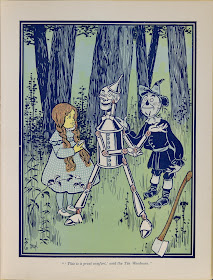
ReplyDeleteMy own view, for what it's worth, is that the only repeated character in this book that shines through as a great cartoon figure is the tinman. He is sleekly drawn and looks like a futurist robot or a fifties advert for a petroleum product.
The great illustrative quality I see here is bound to the lavish printing techniques (notwithstanding the mantle as first American fairytale and answer to or capitalising on Alice in Wonderland popularity). I love many of the marginalia page decorations too, lending a high quality bookart feel to the work, but I would *guess* that there are better individual illustrations of most of the book characters in later editions by different artists.
Makes one think: why do the Harry Potter illos suck so badly?
ReplyDeletepk, has there ever been any mention of why Denslow took the hippocampus as his icon? It seems like a fantastically odd choice for a New Yorker, despite being a fantastically odd New Yorker.
ReplyDeleteDerrick I'm glad you made me go and look. I'd been wondering and hadn't found it on cursory searches. By the way, Denslow was born in Philadelphia and I don't think you could say he was from 'anywhere' particularly - I saw NYC, Chicago and San Francisco noted around a fair bit (but quite a few other places as well)
ReplyDeleteFrom this page we have:
==start quote==
I quote from the bibliography
"Denslow" by Greene and Hearn, p. 35-36:
As these sketches (for the Chicago Herald, 1894), generally signed 'Den', received wider recognition, he frequently added to his signature his "totem" the seahorse (or hippocampus), which he had first used in San Francisco in a
few sea or other water pictures. Probably influenced by the monogram
signatures on Japanese prints (an international fad in the 1890's), many artists adopted totems. James Whistler used a barbed butterfly as his signature; Walter Crane appropriately chose the Japanese crane. As Denslow used his seahorse more and more, he realized that a distinctive signature not only identifies an artist, but also contributes to the overall design of the picture. He wrote to his friend, the photographer Alfred Steiglitz, "It is well to have a sign or totem, as my hippocampus has saved many a composition
for me, and I hold him in reserve for that purpose."
==end quote==
For more info on Baum and Denslow, check out: http://ozproject.egtech.net
ReplyDeleteand
http://ozmapolitan.spaces.live.com
This is such a great blog! I'm so impressed with you! :)
ReplyDeleteDo you have an RSS or Atom feed?
Thanks Alisha.
ReplyDeleteFeed: http://bibliodyssey.blogspot.com/atom.xml
Thanks for your post. I just the other day discovered two Oz books on The Rosetta Project: Rinkitink in Oz and
ReplyDeleteGrandpa in Oz with illustrations by John R. Neill. Turns out they have works by Denslow also, whose I just have to find more of: Denslow's Night Before Christmas, Around the World in a Berry Wagon, and Five Little Pigs.
Excellent post!
ReplyDeleteI particularly like the illustration with Tin Man and Scarecrow in the poppy field.
ReplyDelete-theorist @ fadetheory.com
thanks for answering PK, this blog is a precious daily reading for me, ciao
ReplyDeleteMuchas felicidades por esta excelente web, que estoy disfrutando muchísimo. Os añado a mi blogroll y espero que podamos estar en contacto durante mucho tiempo.
ReplyDeleteUn saludo.
Gracias. Eres muy agradable.
ReplyDeleteInteresting. While there are some things I don't especially like about the Denslow illustrations (I don't really like his version of Dorothy, for instance), much of this looks comfortably familiar, which makes me suspect later illustrators used many of his ideas. The tin woodman, certainly. And also the scarecrow. The film designer evidently went straight to the originals.
ReplyDeletepk,
ReplyDeletethanks for the source info. I had done some cursory reasearch as well and couldnt find anything either.
hi there pk -- have lurked here for a long time and would like to tell you how much i love your blog and all the work you put into sharing this with us! i'm particularly fond of that depiction of the rather disgruntled-looking scarecrow and tinman standing in the field of poppies. i love the angle it's drawn from. keep up the magnificent work!
ReplyDeleteIs this out of print? This is exactly what the book looked like when I first read it as a child.
ReplyDeleteMy guess is that it has never been out of print. Check Amazon - there's a few different species available (popups, annotated, classic etc).
ReplyDeleteI own a nice hardbacked copy of "100th Anniversary Edition" of TWWoO which HarperCollins put out around 2000 (natch). It displays all the pictures (color and tinted) as Baum and Denslow originally designed them. It's certainly still available.
ReplyDeletePaolo asked about the Witch; she's this bizarre eyepatched pigtailed dwarf who bears absolutely no resemblence to Margaret Hamilton's black-cloaked green-skinned nightmare (and I use that last word as the highest of compliments..) It's also interesting how little she actually appears in the book.
Hi Peacay,
ReplyDeleteReally lovely...Glad you left a comment and lured me over here. You're taste ain't too shabby either!
Can you provide any information on the Seahorse picture, more specifically, the "symbols" beside the actual Seahorse? Is this his signature? If so, how is it read?
ReplyDeletekris, this is all a long time ago for me but did you read all the comments above .. I added a quote about the sig. (also, check the links at the bottom of the post). I presume the letters next to the seahorse are "den", as in denslow.
ReplyDelete